Hango App Splitting Bills Application by Den Klenkov |
Home > Winners > #100757 |
 |
|
||||
| DESIGN DETAILS | |||||
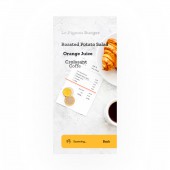
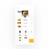
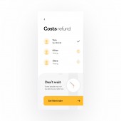
| DESIGN NAME: Hango App PRIMARY FUNCTION: Splitting Bills Application INSPIRATION: I never liked to calculate my part of the check in restaurants. From time to time I tried to find an app with a good UI/UX that solves this problem, but never found. UNIQUE PROPERTIES / PROJECT DESCRIPTION: Hango is an iOS app concept that is designed to simplify the process of bill splitting in a restaurant. Scan a bill, add friends, split it and get your money back in a matter of seconds. Key strengths: quick and efficient scanning using modern technologies (AR, AI), clean and minimalistic design that supports usability, intuitive engaging and informative interactions through out the user journey. The app focuses on one main task and accomplishes it in the cleanest and easiest way. OPERATION / FLOW / INTERACTION: The key steps in interaction are the following: Scan a check, Add participants, Split items and Refund a payer. The app provides a smooth transition to each new step along the way. The UI animations communicate what's happening (like in case of scanning the check or waiting for a refund) or suggesting how to use the app (like when you hold on an item it changes it's state, so it's clear that now you need to drag it somewhere). All the motion timing and easing is precisely chosen for each scenario to be consistent and communicate a certain motion language. PROJECT DURATION AND LOCATION: Started September 2019 in Kyiv Ukraine, ended November 2019 in Kyiv Ukraine FITS BEST INTO CATEGORY: Interface, Interaction and User Experience Design |
PRODUCTION / REALIZATION TECHNOLOGY: The software used: Adobe Photoshop, Sketch, Principle. Used sketch symbols to design faster and have more flexibility. Principle for simpler interactions, After effects for some advanced smooth/liquid/scanni SPECIFICATIONS / TECHNICAL PROPERTIES: Designed in @1x resolution 375x812px (iPhone X) TAGS: app, interaction, ios, finance, minimalistic, clean, modern, clear, typography, food, iphone, restaurant, ui, mobile, split the bill, check, interface RESEARCH ABSTRACT: When paying one bill at a restaurant for a big group of people it’s hard to quickly calculate the amounts for each participant or a smaller group. Or if one person decided to pay and make calculations later, then you need to make photo of the check, do the math and pay off later. This results in spending too much time on calculations during a dinner instead of enjoying each other’s company. I conducted a survey among my friends, colleagues and some other people. It's goal was to confirm the problem existence and to find out in what way people usually solved it. The conclusions were the following: some people don’t have this problem, because in their culture the most common way is splitting the bill equally among participants; other people don’t use banking card in most cases, they rather pay cash right away; more often one person pays by card and gets paid off later; some individuals have some experience in using apps to handle this, but they were not satisfied with the experience they had with them. Finally it was discovered that most people would be happy to have the app to solve this issue. CHALLENGE: The most challenging part was to identify what should be the perfect experience for the users trying to split the bill in restaurants. For this purpose the market research was conducted. I made a list of the biggest user’s frustrations and a list of the things that people like about the existing apps that solve similar problem. Main week points: no scanning functionality or it has a poor performance; it takes longer then reasonable to accomplish the main task (calculate the amounts and pay back); the overall look and feel is outdated and not beautiful, some other features are missing. Based on the survey and the market research, I created and prioritized a feature list. Features for MVP (Minimum Value Product): Scanning check, Displaying the items in a clear and easy way with pictures, Adding friends (contacts) to the party based on their geolocation, Drag-and-drop to split the bill, Payment using fingerprint confirmation, Setting and viewing Reminders to pay or request money later, Notifications, Hangouts history, Profile and Payment settings. For the beta version I left some nice-to-have features like: Simultaneous items claiming from each participant's device, Ability to add tips, Sub-parties who want to pay together. ADDED DATE: 2020-02-25 10:21:16 TEAM MEMBERS (1) : IMAGE CREDITS: Den Klenkov, 2019. PATENTS/COPYRIGHTS: Copyrights belong to Den Klenkov, 2019 |
||||
| Visit the following page to learn more: http://bit.ly/hango-case | |||||
| AWARD DETAILS | |
 |
Hango App Splitting Bills Application by Den Klenkov is Winner in Mobile Technologies, Applications and Software Design Category, 2019 - 2020.· Read the interview with designer Den Klenkov for design Hango App here.· Press Members: Login or Register to request an exclusive interview with Den Klenkov. · Click here to register inorder to view the profile and other works by Den Klenkov. |
| SOCIAL |
| + Add to Likes / Favorites | Send to My Email | Comment | Testimonials | View Press-Release | Press Kit |
Did you like Den Klenkov's Mobile Design?
You will most likely enjoy other award winning mobile design as well.
Click here to view more Award Winning Mobile Design.


