DESIGN NAME:
Lesprit Cafe
PRIMARY FUNCTION:
Restaurant
INSPIRATION:
The designer is appointed by the client who has spent 5 years of preparation to establish a cafe. Despite the operation of the 1st cafe is not ideal, the client has decided to restart the project by setting up a 2nd cafe. This project is born via the combination of various elements including the consideration for the characteristics of the customers, the meals served as well as the customers impression of the 1st cafe, extending the building appearance while unifying the overall visual sense.
UNIQUE PROPERTIES / PROJECT DESCRIPTION:
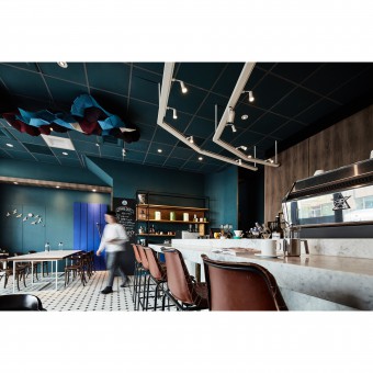
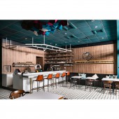
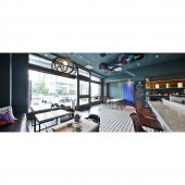
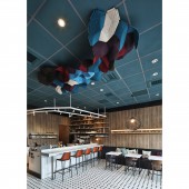
Using the space decoration of the first shop, which is the installation art of clouds, spiritually indicates the idea of dream. Not only emphasizes the visual effect, but also represents the hard work of the client and his persistence in using good ingredients. Considering the functionality, space atmosphere and budget, the rail lighting, previous cafe element is applied on the bar design. The dining area which faces windows, allows customers to admire outdoor scenery or walk around leisurely.
OPERATION / FLOW / INTERACTION:
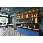
Other than extending the color tone of the building exterior into the interior, the impressive big blue door element from the 1st store is added into the interior space of this project, creating a sense of inheritance. Realizing a calm base tone, it emphasizes on simplicity and the sense of complementary aesthetics between the main theme and decorations, and uses small spotlights and situational lightings to present pleasant tranquility.
PROJECT DURATION AND LOCATION:
The project is located in central west district of Tainan City, Taiwan and completed in May, 2017.
FITS BEST INTO CATEGORY:
Interior Space and Exhibition Design
|
PRODUCTION / REALIZATION TECHNOLOGY:
Due to the cafe is positioned as medium to high price consumption and the customer base is 30-60 years old with a certain income and spending ability, the design is based on a stable atmosphere. The designer has used flat marble, matt brass, black and white tile flooring to present an atmosphere of carm, warm yet stylish. Laminated board is also used for easy maintenance. The furniture used in the first store is also applied into this space to reduce cost and preserve consistent style.
SPECIFICATIONS / TECHNICAL PROPERTIES:
It is located at the ground floor of a building with an area of 66 m2. It includes a kitchen, bar, dining area and etc. Besides removing the wooden partition to widen the space, situational lighting is used to decorate, extending the corners with unique chandelier, emitting soft light and adding liveliness. The space is mainly painted in blue that matches the green color of the building exterior. The space required for kitchen facilities and pipings are arranged to suit operation needs.
TAGS:
morden, cafe, flat marble, matt brass, tile flooring
RESEARCH ABSTRACT:
The designers and their client have mutual anticipation of stability and spiritual balance for this project. Considering meal price positioning, customer base, etc. dark tones are used presenting a calm atmosphere, strong personality via clean lines, cement texture and the matching of high color saturation, show the resilience of the client. Elements from the 1st store and the entrepreneurial spirit of the client are inherited, add a sense of familiarity to the customers.
CHALLENGE:
The main challenge is the budget constraint. With aesthetic expression of the anticipated space atmoshpere, the budget is controlled via the use of hardware and software from the 1st store, like hanging display cabinets, guest tables, dining chairs, etc. How to avoid waste of space, smoothen the work flow, optimize the manpower time are the major topics. They are solved via continuous practices of the space flow. Large tungsten filament bulbs are used in the interior to attract the passersby.
ADDED DATE:
2020-02-25 05:37:40
TEAM MEMBERS (2) :
Chen Tung Chieh and Chou Chun Hsiao
IMAGE CREDITS:
LEO DAI
|
