X-power Gym Fitness Space by Fei Fang |
Home > Winners > #100074 |
 |
|
||||
| DESIGN DETAILS | |||||
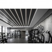
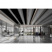
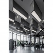
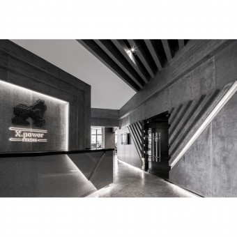
| DESIGN NAME: X-power Gym PRIMARY FUNCTION: Fitness Space INSPIRATION: When the owner put the name of "X-Power" on the design desktop, the designers immediately decided to penetrate the "X" element in this space, not only simply copy mechanically, but also deconstruct, interpret and reshape. It symbolizes mystery and unknown, and what kind of spark should be produced when it collides with gym. After the collision of ideas, the answer is "rationality&qu UNIQUE PROPERTIES / PROJECT DESCRIPTION: The designers have made the gym space unprecedented rational, without a little curved surface and arc. The main tone of gray, with simple to extreme lighting, brings the rationality of the symbol "X" in the mathematical formula to the interpretation of the whole space. The design elements that can be used are only simplified into three kinds: rectangle, polyline and line surface light source. Subtraction in the whole space is the difficulty and breakthrough in design. OPERATION / FLOW / INTERACTION: In the performance of light at night, the use of LED point light source is greatly reduced, the proportion of line light source and face light source is increased, and the thin line light source is revealed from the gap of broken line, the face light source film composed of multiple rectangles on the top is distributed in proportion, the hidden light source is used to highlight the shadow under the power line. PROJECT DURATION AND LOCATION: The project started in July 2019 in Kunming and finished in September 2019 in Kunming. FITS BEST INTO CATEGORY: Interior Space and Exhibition Design |
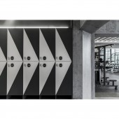
PRODUCTION / REALIZATION TECHNOLOGY: The original building has a good lighting area and floor glass. The designers change the angle of light into the space through the vertical modeling, echoing the sense of machinery and strength. The natural light comes from the gap of the whole fan blade shape and pours on the ground at a certain angle, which echoes the same shape of the top surface. It is clean and without a trace of drag, rational enough to be cool. SPECIFICATIONS / TECHNICAL PROPERTIES: The project covers a total of 520 square meters. TAGS: Interior, Commercial, Fitness Space, Modern, Simple, Pure, Minimalist, Industrial Style, X, Gym RESEARCH ABSTRACT: Under the subtraction, the fitness space that should have been more emotional and warm-blooded has become rational and calm. This is a bold attempt, but also reasonable. Because designers want customers to gradually feel a kind of "conflict" in the process of getting along with this space, which is hard to detect, but can not be ignored. CHALLENGE: The rectangular block is embedded in the wall to create the texture of cement pouring. The similar technique is the finishing touch applied in the front door and the free force area. At the same time, light is also the focus of thinking in the design of the fitness space. ADDED DATE: 2020-02-22 15:22:16 TEAM MEMBERS (3) : Fei Fang, Xiaolin Yang and Xingpeng Zhu IMAGE CREDITS: Image #1: Photographer Chuan He, Lobby, 2019. Image #2: Photographer Chuan He, Strength Training Area, 2019. Image #3: Photographer Chuan He, Private Parish, 2019. Image #4: Photographer Chuan He, Aerobic Training Area, 2019. Image #5: Photographer Chuan He, Lockers, 2019. PATENTS/COPYRIGHTS: Copyrights belong to Fei Fang, 2019. |
||||
| Visit the following page to learn more: http://c7.gg/fUSvf | |||||
| AWARD DETAILS | |
 |
X-Power Gym Fitness Space by Fei Fang is Winner in Interior Space and Exhibition Design Category, 2019 - 2020.· Read the interview with designer Fei Fang for design X-power Gym here.· Press Members: Login or Register to request an exclusive interview with Fei Fang. · Click here to register inorder to view the profile and other works by Fei Fang. |
| SOCIAL |
| + Add to Likes / Favorites | Send to My Email | Comment | Testimonials | View Press-Release | Press Kit |
Did you like Fei Fang's Interior Design?
You will most likely enjoy other award winning interior design as well.
Click here to view more Award Winning Interior Design.


