South Branch Sign Restaurant by Tiao Ouyang |
Home > Winners > #100068 |
 |
|
||||
| DESIGN DETAILS | |||||
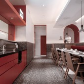
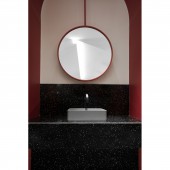
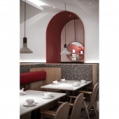
| DESIGN NAME: South Branch Sign PRIMARY FUNCTION: Restaurant INSPIRATION: This is a branch design of Hong Kong-style chain brand restaurant. The designer starts from the inner dimension of environmental construction, through in-depth thinking and combing the relationship between food and culture, fashion and tradition, and disseminates the emotional communication channel to the heart. UNIQUE PROPERTIES / PROJECT DESCRIPTION: In this case, the design team follows the brand's consistent concise approach, focusing on highlighting the virtual and real space and liquidity. With transparent, pure and delicate visual presentation, in a rational and fashionable style, the designers get rid of the public's inherent impression of Hong Kong-style restaurants, which is flexible and comfortable. OPERATION / FLOW / INTERACTION: With the help of terrazzo, wood, cortex and mirror, the interface between the two rooms is not only transitional extension, but also detail level, which sets off a rich and diverse spatial texture. PROJECT DURATION AND LOCATION: The project started in March 2019 in Changzhou and finished in May 2019 in Changzhou. FITS BEST INTO CATEGORY: Interior Space and Exhibition Design |
PRODUCTION / REALIZATION TECHNOLOGY: The designers uses different materials and colors to distinguish different functional areas, which reduces the physical partition in space and makes the functional layout appear in the invisible partition, and has a great sense of bulk. At the same time, it shows a simple texture in the design. SPECIFICATIONS / TECHNICAL PROPERTIES: The project covers a total of 500 square meters. As far as the eye can see, the smooth lines are laid out on the facade and the top, outlining the delicate texture details, and the inlaid exquisite lighting makes the texture sublimate. TAGS: Interior, Restaurant, Commercial, Modern, Simple, New Hong Kong Style, South Branch Sign, Fashionable RESEARCH ABSTRACT: The quality and variety of products are only the basic demands of diners, while situational environment, personalization and brand aesthetics are the important factors of brand circle fans. Therefore, how to have both "authentic Hong Kong taste" and a new perspective and thinking has become the focus of space expression in this case. CHALLENGE: Compared with last year's South Branch Sign Jiangyin project, although this case is more concise and low-key, its temperament is more mature and stable, just like the process of brand growth, from immature to mature, step by step, with the trend, and with the time. Here, we can not find the old Hong Kong-style noise, both the implicit tenderness of the East and the classical rhythm of the West, so compatible and new style, like the heart of Hong Kong. ADDED DATE: 2020-02-22 13:04:15 TEAM MEMBERS (3) : Tiao Ouyang, Danfeng Zhou and Yang Li IMAGE CREDITS: Image #1: Photographer Yiwen Xu, South Branch Sign, 2019. Image #2: Photographer Yiwen Xu, South Branch Sign, 2019. Image #3: Photographer Yiwen Xu, South Branch Sign, 2019. Image #4: Photographer Yiwen Xu, South Branch Sign, 2019. Image #5: Photographer Yiwen Xu, South Branch Sign, 2019. PATENTS/COPYRIGHTS: Copyrights belong to Tiao Ouyang, 2019. |
||||
| Visit the following page to learn more: http://c7.gg/fUSvk | |||||
| AWARD DETAILS | |
 |
South Branch Sign Restaurant by Tiao Ouyang is Winner in Interior Space and Exhibition Design Category, 2019 - 2020.· Read the interview with designer Tiao Ouyang for design South Branch Sign here.· Press Members: Login or Register to request an exclusive interview with Tiao Ouyang. · Click here to register inorder to view the profile and other works by Tiao Ouyang. |
| SOCIAL |
| + Add to Likes / Favorites | Send to My Email | Comment | Testimonials | View Press-Release | Press Kit |
Did you like Tiao Ouyang's Interior Design?
You will most likely enjoy other award winning interior design as well.
Click here to view more Award Winning Interior Design.


