| THE AWARD |
| CATEGORIES |
| REGISTRATION |
| SUBMIT YOUR WORK |
| ENTRY INSTRUCTIONS |
| TERMS & CONDITIONS |
| PUBLICATIONS |
| DATES & FEES |
| METHODOLOGY |
| CONTACT |
| WINNERS |
| PRESS ROOM |
| GET INVOLVED |
| DESIGN PRIZE |
| DESIGN STORE |
| THE AWARD | JURY | CATEGORIES | REGISTRATION | PRESS | WINNERS | PUBLICATIONS | ENTRY INSTRUCTIONS |
Odtu Sanat 20 Visual Identity Design by Kenarköse Creative |
Home > Winners > Design #97941 >Interview |
 |
|
FS: What is the main principle, idea and inspiration behind your design?
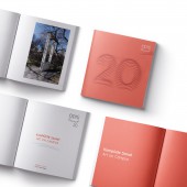
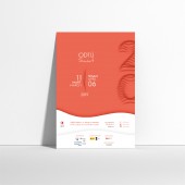
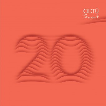
KC: The design idea came from the institution’s special request to highlight the consequent 20 years of the art festival. Therefore, the twentieth year of the art festival was seen as a covered art piece to be unveiled. Our design strategy was to achieve a subtle but compelling visual identity system that would instantly interact with the audience in various environments. Shadows of the same colored layers that form the numbers 2, and 0 created a 3D illusion. This illusion gives the feeling of relief and the numbers look like they melted into the background. The vivid color choice creates a subtle contrast with the tranquility of the wavy 20.
FS: What has been your main focus in designing this work? Especially what did you want to achieve?
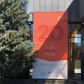
KC: Our main focus was to highlight the consequent twenty years of the art festival as per the client’s request. Therefore, we wanted to put an emphasis on the number 20 itself. We also wanted our design to be easily recognized anywhere on the campus.
FS: How long did it take you to design this particular concept?
KC: We started working on design concepts in November. The final version of this concept, however, was selected approximately after three months starting the initial ideas. During the process, we dedicated almost one month to develop this particular design concept.
FS: Why did you design this particular concept? Was this design commissioned or did you decide to pursuit an inspiration?
KC: This particular concept was among several others of which we presented. However, during the meetings, we especially wanted to focus on this concept because according to us this was the most successful one to meet the client's needs.
FS: Where there any other designs and/or designers that helped the influence the design of your work?
KC: According to us, every design concept that we come up with is influenced by many artists and designers even if we are not consciously aware of it. For this particular one, we can say that our most important inspiration was Lucio Fontana’s works.
FS: Who is the target customer for his design?
KC: In addition to METU students, instructors, and staff, the target audience was kept broad for all art lovers located in Ankara.
FS: What sets this design apart from other similar or resembling concepts?
KC: Highlighting the 20th year in a subtle manner was a difficult job. This design concept was the strongest to achieve this intent. We believe that the vivid color choice creates a subtle contrast with the tranquility of the wavy 20.
FS: How did you come up with the name for this design? What does it mean?
KC: The design is named by the art festival itself. We were not expected to come up with a different name.
FS: Which design tools did you use when you were working on this project?
KC: We used certain photo manipulating and illustration oriented design software while working on this project.
FS: What is the most unique aspect of your design?
KC: For us, the most unique aspect of this design is the effective use of shadows. Thanks to this, we managed to keep the color palette to be as limited as it could be.
FS: Who did you collaborate with for this design? Did you work with people with technical / specialized skills?
KC: The design concept is developed among our team. However, the ODTU Sanat administrative committee was a crowded team consisting of members with various design and fine arts backgrounds. Therefore, during meetings, we exchanged many ideas with the committee.
FS: What is the role of technology in this particular design?
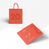
KC: The design tools and plugins were very helpful both for achieving the desired effect and for the design to appear in various media without a loss. The vector format ensured the design to appear the same in all printed materials in various sizes.
FS: Is your design influenced by data or analytical research in any way? What kind of research did you conduct for making this design?
KC: This was the fourth consecutive year of our team designing the visual identity system for ODTU Sanat. Also, being graduated from ODTU we were quite familiar with the university values and its identity. Therefore, the research phase for this project was done both consciously during the design process but it was also supported subconsciously by the knowledge came from our familiarity with the institution.
FS: What are some of the challenges you faced during the design/realization of your concept?
KC: The biggest challenge was to be easily recognized in the METU campus, the largest green campus in Ankara. The visibility, legibility, noticeability were to be provided since there were many printed and digital materials to be designed and produced. In addition, as mentioned earlier, ODTU Sanat administrative committee is a crowded team consisting of members with various design and fine arts backgrounds. The other creative challenge for us was to come up with a design idea that could bring together the challenging opinions of the committee into a single system.
FS: How did you decide to submit your design to an international design competition?
KC: We were very pleased and confident in this design. Also, we received many positive feedbacks from both the administrative committee members and other designers which encouraged us to submit our design to A’Design Award & Competition.
FS: What did you learn or how did you improve yourself during the designing of this work?
KC: During the design process, we always kept in mind that the visual identity system to be as flexible as it can. We were also very familiar with the variety of design materials from our previous experience in the same art festival’s visual identity system. In the end, we believe that we could come up with a very flexible visual identity system that could be applied in many printed and digital media.
FS: Thank you for providing us with this opportunity to interview you.
A' Design Award and Competitions grants rights to press members and bloggers to use parts of this interview. This interview is provided as it is; DesignPRWire and A' Design Award and Competitions cannot be held responsible for the answers given by participating designers.
| SOCIAL |
| + Add to Likes / Favorites | Send to My Email | Comment | View Press-Release | Translations |

