| THE AWARD |
| CATEGORIES |
| REGISTRATION |
| SUBMIT YOUR WORK |
| ENTRY INSTRUCTIONS |
| TERMS & CONDITIONS |
| PUBLICATIONS |
| DATES & FEES |
| METHODOLOGY |
| CONTACT |
| WINNERS |
| PRESS ROOM |
| GET INVOLVED |
| DESIGN PRIZE |
| DESIGN STORE |
| THE AWARD | JURY | CATEGORIES | REGISTRATION | PRESS | WINNERS | PUBLICATIONS | ENTRY INSTRUCTIONS |
Texts From Graphics by The Reset Co. |
Home > Winners > Design #88219 >Interview |
 |
|
FS: What is the main principle, idea and inspiration behind your design?
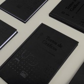
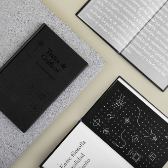
EM: The book focuses mainly on essays of graphic designers in which they talk about their ideas and craft. The main inspiration for this design was the creative processes that graphic designers themselves follow to solve communication problems. We got inspiration from the way they simplify and synthesize complex messages into visual form so we developed an iconographic system that would, likewise, communicate the complex ideas discussed through immediate representative icons.
FS: What has been your main focus in designing this work? Especially what did you want to achieve?
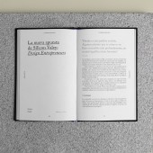
EM: Being this a theoretical document, our main focus designing this work was to organize the texts in a a compelling way which would make the reading lighter and dynamic. We wanted the text to be the protagonist and we achieved it through typographical selections and composition to highlight the most important takeaways.
FS: What are your future plans for this award winning design?
EM: The first thing we want with this award is to wear it, for us it is a pride to participate in this type of contest and to have won. Showing that we have won is an achievement that pushes us to do better in each project. Participating in the following editions is something that we highly consider.
FS: How long did it take you to design this particular concept?
EM: This project was developed in approximately 5 months since we had to adapt to the content configuration times.
FS: Why did you design this particular concept? Was this design commissioned or did you decide to pursuit an inspiration?
EM: The concept was created to summarize this theoretical and information-packed book, with elements that are very easy to interpret such as icons. This design was commissioned by Universidad de Monterrey as they were publishing this book in an upcoming local book fair.
FS: Is your design being produced or used by another company, or do you plan to sell or lease the production rights or do you intent to produce your work yourself?
EM: The design was sold to Universidad de Monterrey.
FS: What made you design this particular type of work?
EM: Our agency is characterized by a profound love for editorial design and the detailed and silent craft of setting text. This project was an opportunity to keep doing what we enjoy and at the same time it brought its own challenges we were excited to solve, specially touching on a topic we’re passionate about: graphic design.
FS: Where there any other designs and/or designers that helped the influence the design of your work?
EM: We have always admired the work of colleagues trying to break the status quo while respecting the technicalities of function and form, such as folch studio
FS: Who is the target customer for his design?
EM: It is focused on designers, teachers, and students who live the educational environment day by day. It is a specialized book for professionals who understand academic issues and the design approach.
FS: What sets this design apart from other similar or resembling concepts?
EM: What makes this design special is making the most with the least. The brief of this project came with its own restrictions, and in this case we were limited in terms of color. However we managed to achieve a simple and interesting aesthetic through our conceptual and typographic choices, thus reinforcing one of the bases of graphic design itself: less is more.
FS: How did you come up with the name for this design? What does it mean?
EM: The name Texts from Graphics was given to us and it is quite direct and descriptive as it is intended to be a theoretical document for consultation purposes.
FS: Which design tools did you use when you were working on this project?
EM: We used InDesign, Illustrator, paper and pencil.
FS: What is the most unique aspect of your design?
EM: The custom iconographic system we developed and how it unfolds throughout the book, creating a new layer of visual communication.
FS: Who did you collaborate with for this design? Did you work with people with technical / specialized skills?
EM: We worked for hand in hand with the content writing team of the University of Monterrey, it was the team that contacted us to participate in this project. The team was comprised of University academics, design professionals, and administrative staff.We also work with Karina Zertuche, who photographed the book and has collaborated with us on many of our projects.
FS: What is the role of technology in this particular design?
EM: In this particular design we utilized technology as a tool to develop the design in our respective programs, but as well to assure optimal reading experiences for the user.
FS: Is your design influenced by data or analytical research in any way? What kind of research did you conduct for making this design?
EM: The research is based on the opinions of graphic design teachers who, through essays, provide a project that guides students for professional improvement. We also interview design students as end-users to understand them and develop the concept of the book.
FS: What are some of the challenges you faced during the design/realization of your concept?
EM: The budget was the most obvious limitation, as we faced several challenges. On the one hand, we had to develop a book for designers that was quite attractive to read, and on the other hand, we had to find a way to summarize these essays with graphic elements that would make the reading much more digestible. For a production with these characteristics, a colorful book is expected as well as functional.
FS: How did you decide to submit your design to an international design competition?
EM: The challenge that the development of this book represented to us and the result that it had, when exposed at the 2018 book fair, was what motivated us to submit it to the competition. We believe that showing how we found the solution for the customer should be counted and shown to more people.
FS: What did you learn or how did you improve yourself during the designing of this work?
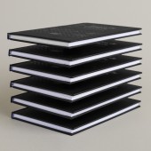
EM: We learned again about how the materials for the production of the book, despite being economical, stand out through the design and implementation of the concept developed and the finishes implemented. He challenged us at all times and all the objectives set were met.
FS: Any other things you would like to cover that have not been covered in these questions?
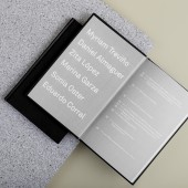
EM: Something to highlight is the design of the index since we look for a way to get away from the conventional to highlight the name of the teachers and the name of their essays. In this way, we build a different dynamic in the development of this theoretical book in which the protagonists are the same teachers.
FS: Thank you for providing us with this opportunity to interview you.
A' Design Award and Competitions grants rights to press members and bloggers to use parts of this interview. This interview is provided as it is; DesignPRWire and A' Design Award and Competitions cannot be held responsible for the answers given by participating designers.
| SOCIAL |
| + Add to Likes / Favorites | Send to My Email | Comment | View Press-Release |

