| THE AWARD |
| CATEGORIES |
| REGISTRATION |
| SUBMIT YOUR WORK |
| ENTRY INSTRUCTIONS |
| TERMS & CONDITIONS |
| PUBLICATIONS |
| DATES & FEES |
| METHODOLOGY |
| CONTACT |
| WINNERS |
| PRESS ROOM |
| GET INVOLVED |
| DESIGN PRIZE |
| DESIGN STORE |
| THE AWARD | JURY | CATEGORIES | REGISTRATION | PRESS | WINNERS | PUBLICATIONS | ENTRY INSTRUCTIONS |
Imperial Palaces Wine Packaging by Min Lu |
Home > Winners > Design #85264 >Interview |
 |
|
FS: What is the main principle, idea and inspiration behind your design?
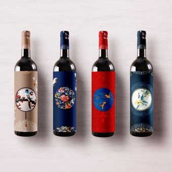
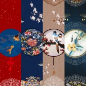
ML: The packaging design was inspired by Qing Dynasty traditional Chinese patterns. The patterns on the bottles had abundant means of artistic expression and shows exquisite elegance and luxuriant cultural implication of China. There are stories behind these patterns. Fish symbolize wealth and abundance. It is also signifies marriage and the birth of many children. Peony known as the king of the flowers. It’s a symbol of royalty, virtue and wealth. The crane is a symbol of longevity.
FS: What has been your main focus in designing this work? Especially what did you want to achieve?
ML: This design evokes the exquisite elegance and luxuriant cultural implication of ancient patterns. Customers can collect the set as a special collection and then later re-use the bottles as different design elements in their homes.
FS: How long did it take you to design this particular concept?
ML: This project was started in December 2018 in United States and finished in February 2019.
FS: What made you design this particular type of work?
ML: Knowing that people care for condition of their products (including the bottle packing since the bottle can later be used for decoration purposes), focus was on creating a package design that would gain media attention. The goal was to have buyers reconsider the product not only as a wine set itself, but also the meaning behind the product and the memorable moments it created. Research has been done related to symbolism of Chinese Ancient decoration.The designs has become one of the Chinese culture and had glorious history and have attracted people's attention globally.
FS: Where there any other designs and/or designers that helped the influence the design of your work?
ML: The design was inspired by Qing Dynasty traditional Chinese patterns.
FS: Who is the target customer for his design?
ML: Wine lover, home decoration lover as well as people all over the world who purchase the wine set as a gift during holidays
FS: What sets this design apart from other similar or resembling concepts?
ML: The goal was to have buyers reconsider the product not only as a wine set itself, but also the meaning behind the product and the memorable moments it created.
FS: How did you come up with the name for this design? What does it mean?
ML: The name of the design is Imperial Palaces, the patterns usually used by the Imperial Palaces. The patterns on the bottles had abundant means of artistic expression and shows exquisite elegance and luxuriant cultural implication of China.
FS: Which design tools did you use when you were working on this project?
ML: Adobe creative suite
FS: What is the most unique aspect of your design?
ML: it's not only a wine set but also a representation of Chinese art culture
FS: Who did you collaborate with for this design? Did you work with people with technical / specialized skills?
ML: The design was solely completed by myself
FS: What is the role of technology in this particular design?
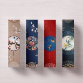
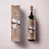
ML: Digitally print.The label and box contains gold foil hot stamped. Matte varnish was also used on the box surface.
FS: Is your design influenced by data or analytical research in any way? What kind of research did you conduct for making this design?
ML: Yes, conducted user experience research. Knowing that people care for condition of their products (including the bottle packing since the bottle can later be used for decoration purposes), focus was on creating a package design that would gain media attention. The goal was to have buyers reconsider the product not only as a wine set itself, but also the meaning behind the product and the memorable moments it created.
FS: What are some of the challenges you faced during the design/realization of your concept?
ML: The greatest challenge came with the illustration, which employed ancient printing techniques and digital illustration. These two combined perfectly and produced excellent results. The choice of types of paper is also an essential part of the project. It expresses its classic character through cotton-like textures.
FS: How did you decide to submit your design to an international design competition?
ML: Making the design work getting media exposure internationally
FS: Thank you for providing us with this opportunity to interview you.
A' Design Award and Competitions grants rights to press members and bloggers to use parts of this interview. This interview is provided as it is; DesignPRWire and A' Design Award and Competitions cannot be held responsible for the answers given by participating designers.
| SOCIAL |
| + Add to Likes / Favorites | Send to My Email | Comment | View Press-Release | Translations |


