| THE AWARD |
| CATEGORIES |
| REGISTRATION |
| SUBMIT YOUR WORK |
| ENTRY INSTRUCTIONS |
| TERMS & CONDITIONS |
| PUBLICATIONS |
| DATES & FEES |
| METHODOLOGY |
| CONTACT |
| WINNERS |
| PRESS ROOM |
| GET INVOLVED |
| DESIGN PRIZE |
| DESIGN STORE |
| THE AWARD | JURY | CATEGORIES | REGISTRATION | PRESS | WINNERS | PUBLICATIONS | ENTRY INSTRUCTIONS |
Farmrise Mobile Application by Lollypop Design Studio |
Home > Winners > Design #71284 >Interview |
 |
|
FS: What is the main principle, idea and inspiration behind your design?
LS: More than 50% of the Indian population is dependent on agriculture and almost 85% of the farms are below 2 hectares. These marginal farmers often struggle to receive agronomic training or access to credit; this negatively affects their productivity and income. The app empowers farmers by providing access to scientific knowledge and reduces middlemen monopoly by connecting marketplace. This initiative also aims to increase productivity and prepare farmers to feed the growing world population.
FS: What has been your main focus in designing this work? Especially what did you want to achieve?
LS: Farmrise main focus on accessibility. We wanted this app to be used by farmers and not just land as any other app in the market. Hence, we ensured that it becomes a one-stop solution for them and answers all their needs. Farmrise empowers the Indian farmer community by helping them overcome the historic obstacle of isolation and gives them access to educational, and in many cases, scientific information for the first time. Application successfully binds the fragmented ecosystem providing a one-stop solution and helps improve the decision making. The app runs smoothly on low-speed 2g/3g and with its features of agronomy advisory and crop prices, it improves the farmers yield thereby improving their income and standard of living.
FS: What are your future plans for this award winning design?
LS: We are expanding designs in different countries and increasing its features and availability across different geographical terrains.
FS: How long did it take you to design this particular concept?
LS: Close to about a year. Three months of On-Site Research, Close to six months of Design, two months of Usability testing and a month of improvements.
FS: Why did you design this particular concept? Was this design commissioned or did you decide to pursuit an inspiration?
LS: We designed this for our client Climate Corporation. The concept has the power to improve the lifestyle of over 50% of Indian populations and this is extremely motivating.
FS: Is your design being produced or used by another company, or do you plan to sell or lease the production rights or do you intent to produce your work yourself?
LS: We designed this for our client Climate Corporation.
FS: What made you design this particular type of work?
LS: The problem statement was our inspiration as we had a chance to impact a billion life with our design. More than 50% of the Indian population is dependent on agriculture and almost 85% of the farms are below 2 hectares. These marginal farmers often struggle to receive agronomic training or access to credit; this negatively affects their productivity and income. T
FS: Where there any other designs and/or designers that helped the influence the design of your work?
LS: • Design Director: Anil Reddy • Researcher: Shrut Kirti • Lead Designer: Jennifer Sharmila • Illustrator: Preethika Asokan • Project Manager: Deepa Mani Subbarayan
FS: Who is the target customer for his design?
LS: Farmers
FS: What sets this design apart from other similar or resembling concepts?
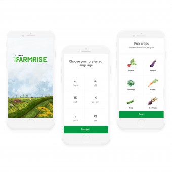
LS: It's a one-stop solution and our focus on ensuring that it is usable. This app is not fancy, it is tailored for our target audience, farmers, who are not tech savvy and are not literate. If you notice the whole app works on a tap gesture as farmers are used to that but not typing.
FS: How did you come up with the name for this design? What does it mean?
LS: It was given to us.
FS: Which design tools did you use when you were working on this project?
LS: Farmrise posed extreme challenges as the app posed many tech limitations while users demanded high visual elements. The research team used questionnaires, focused group discussions, and observation techniques while wireframes were created on sketch. Lifelike illustrations were made to compensate visual demand while maintaining asset size. Illustrator, photoshop, and invision were used for visual design and prototyping.
FS: What is the most unique aspect of your design?
LS: Farmrise empowers the Indian farmer community by helping them overcome the historic obstacle of isolation and gives them access to educational, scientific information for the first time. Application successfully binds the fragmented ecosystem providing a one-stop solution and improves farmers decision making. The app runs smoothly on low-speed 2g/3g as it uses google fonts and has intelligent caching. For increased familiarity, the app uses lifelike illustrations without increasing asset weight.
FS: Who did you collaborate with for this design? Did you work with people with technical / specialized skills?
LS: Just the in-house team and Climate Corp team (product owners)
FS: What is the role of technology in this particular design?
LS: The technology was very limiting for us given the low-end phones and low literacy levels in our target audience. The challenge was to turn these limitations into solutions and produce designs that were usable.
FS: Is your design influenced by data or analytical research in any way? What kind of research did you conduct for making this design?
LS: We conducted Ethnographic research, with 150+ farmers across India over a period of 3 months. Insights were gained on farmers day to day activities, processes, crop cycles, and the cognitive factors that conditioned their decision making. Insights clarified the tech savviness, psyche and real pain points of farmers. The most essential revelation was that our app had to be ecosystem-centric as the influencers played a crucial role in the decision making of our target audience.
FS: What are some of the challenges you faced during the design/realization of your concept?
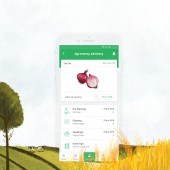
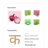
LS: Major technological challenges were poor connectivity, low-speed internet and, poor ram phones. Whereas, the main design challenge was to have a visually heavy app that a farmer could relate to. To tackle these challenges, we decided to make the app really light by keeping design assets to the minimum. The app has only one brand color, ‘green’ and is mixed with ample white spaces. For the font, noto sans was used because it preloads and is multilingual. Data caching was also enabled to ensure that farmer could access some information on their crop even when they have low or no connectivity. Custom watercolor-like illustrations were made to make the app visually heavy and relatable while having complete control of the size. Finally, app usage behavior of the target audience was leveraged; hence app requires only tapping and has google feed like structure.
FS: How did you decide to submit your design to an international design competition?
LS: We have already won many awards for Farmrise and we were confident that our designs were worth showcasing to the world.
FS: What did you learn or how did you improve yourself during the designing of this work?
LS: We learned that there is always a solution and that we need to keep reminding ourselves of who our target audience is.
FS: Any other things you would like to cover that have not been covered in these questions?
LS: Farmrise has won India's Best Design Project award.
FS: Thank you for providing us with this opportunity to interview you.
A' Design Award and Competitions grants rights to press members and bloggers to use parts of this interview. This interview is provided as it is; DesignPRWire and A' Design Award and Competitions cannot be held responsible for the answers given by participating designers.
| SOCIAL |
| + Add to Likes / Favorites | Send to My Email | Comment | View Press-Release |


