| THE AWARD |
| CATEGORIES |
| REGISTRATION |
| SUBMIT YOUR WORK |
| ENTRY INSTRUCTIONS |
| TERMS & CONDITIONS |
| PUBLICATIONS |
| DATES & FEES |
| METHODOLOGY |
| CONTACT |
| WINNERS |
| PRESS ROOM |
| GET INVOLVED |
| DESIGN PRIZE |
| DESIGN STORE |
| THE AWARD | JURY | CATEGORIES | REGISTRATION | PRESS | WINNERS | PUBLICATIONS | ENTRY INSTRUCTIONS |
Kuriosity Store by Lip Chiong - Studio Twist |
Home > Winners > Design #51379 >Interview |
 |
|
FS: What is the main principle, idea and inspiration behind your design?
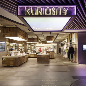
SA: The main idea is to create a store space that is an immersive room of open showcases that reveal “treasures” within, inspired by 17th century “cabinets of curiosity” where extraordinary objects found by explorers were displayed.
FS: What has been your main focus in designing this work? Especially what did you want to achieve?
SA: Kuriosity is a multi-brand platform that showcases fashion, design, culture and art, and the physical store is linked and supported by the media found in the web store. Our main focus emphasized on readability, and story-telling was an important aspect, not just about the products or the creators, but also the community of customers and users of these products.
FS: What are your future plans for this award winning design?
SA: We look forward to K11 opening other Kuriosity Art Stores after the success of this first flagship store.
FS: How long did it take you to design this particular concept?
SA: We came up with the design concept in a month and its subsequent development took 3 more months before construction started.
FS: Why did you design this particular concept? Was this design commissioned or did you decide to pursuit an inspiration?
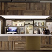
SA: We knew from day one that the brand will have an ever-changing range of products of different types, a sort of an eclectic collector’s room of curiosities so to speak, and when we did some research into the word curiosity in the context of architecture, the image of curiosity chambers from 17th century came up. It is interesting to see how artefacts or archaeological items that are yet to be named or classified are showcased by placing them in a kind of array, perhaps sometimes with a box so that the object has its own niche or space, even though it can be very closely placed to the next object. It is as if the process of classification is underway, and the room was a frozen snapshot. Autonomy within diversity, this simple but effective way of organization seemed to be highly flexible, for example in our store, we designed some walls so that differently sized boxes are embedded with an open front and each box has its inner linings that are changeable. Products of a similar or complementary nature can be placed within each niche, so the architecture of the store is specific and also up for curatorship of the operator.
FS: Where there any other designs and/or designers that helped the influence the design of your work?
SA: Our sources of inspiration is quite wide-ranging, from other exemplary retail stores and interior projects, to lighting designs and installation artists.
FS: Who is the target customer for his design?
SA: The target customers are people who have and appreciate design and artistic lifestyles. This is a store within the K11 shopping mall in Shanghai, so it is open to walk-in-customers. Kuriosity also invited designers and artisans to host workshops within the store, so during one of these events, one of our display boxes will be transformed into a workshop table for up to 10 participants to be seated.
FS: What sets this design apart from other similar or resembling concepts?
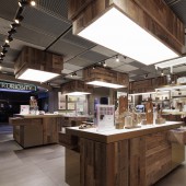
SA: The level of engagement between people and the store is enhanced through instilling the element of discovery and interactivity in the infinity window display, likened to an art installation space. The brief asked for many things, and one of them is to be able to hold events within the store, the largest of which will be a fashion show for a small group of customers, or some kind of product launch with the product designer giving a speech. That naturally steered us to design most of the display units within the store to be mobile so that we can push everything to one end of the store and open up an open floor space for these events to take place.
FS: How did you come up with the name for this design? What does it mean?
SA: The brand name is provided by our client K11 Concepts Ltd.
FS: Which design tools did you use when you were working on this project?
SA: From hand sketches to 3D digital modelling and physical models in our studio to making 1:1 mock-ups in the factory workshop.
FS: What is the most unique aspect of your design?
SA: The most unique feature is the infinity window display room. Also the store is made of mobile furniture pieces that are transformable, for example from a display box to a workshop table.
FS: Who did you collaborate with for this design? Did you work with people with technical / specialized skills?
SA: Our client, K11 Concepts Ltd., is in a way our biggest collaborator. The ambition of the brand and the brief was provided by K11 which was then interpreted unexpected ways through our design, guided by constant feedback from them. We also worked with specialist metal workshops, and LED suppliers that helped us to programme the colour sequence and lighting of products activated by motion sensor.
FS: What is the role of technology in this particular design?
SA: Technology is used to create interactivity in this design. The construction of the infinity window display room with changing coloured lighting and product lighting activated by motion sensors is the key piece of technology in the design of the physical store, as well as the mobile and transformable display furniture including the 5 light boxes suspended from the ceiling over these display boxes whose heights are adjustable by remote control according to the store layout.
FS: Is your design influenced by data or analytical research in any way? What kind of research did you conduct for making this design?
SA: We did general research in retail display methods and art lighting installation precedents that were instrumental in the early design stages.
FS: What are some of the challenges you faced during the design/realization of your concept?
SA: One of the main challenges is the building of the infinity window display box. It is a room in the shape of a box, and each of the wall, floor and ceiling surfaces are designed to be a portal that seemed infinite, and the most difficult thing to achieve is to create infinite reflections neatly projected without any misalignment on all faces of a cubic room that you can step into. The floor and ceiling are both double panels of toughened glass measuring 2.5m by 1.7m with delicate reflective coating facing each other, whilst the rest of the glass walls are 2.3m tall, and for each face 2 coloured LED strips run around the border in between the glass panels. The vertical and horizontal glass panels must rest on the steel frame with equal overlaps following a strict installation sequence. We finally did it through precise 3D modelling and long workshop sessions with the dedicated makers of the project.
FS: How did you decide to submit your design to an international design competition?
SA: We were encouraged by our clients K11 Concepts Ltd. to participate our design in international design competitions. We think this is a special retail + art project.
FS: What did you learn or how did you improve yourself during the designing of this work?
SA: We started the design with a rather muted palette of metallic and mono-tone materials, thinking that the diversity of the products meant that they were likely to be colourful, letting them “speak” for themselves. However, very quickly into the schematic design, our client started to steer us towards certain tactile materials, in particular recycled timber, and more or less banned us from using black with the reason that colour activated emotion which leads to better retail activity. That path led us to be more experimental, and we started to match different kinds of recycled timber, and different kinds of metallic brass finished. We wanted to push the boundary of what may be considered a safe designer look, and went for high contrasts between warm and cool, rough and smooth, shiny and matt and so on. It was instinctive and visual and fun, and we spent a lot of time in the factory physically laying out where each of the recycled timber planks go together with the metallic accent panels.
FS: Thank you for providing us with this opportunity to interview you.
A' Design Award and Competitions grants rights to press members and bloggers to use parts of this interview. This interview is provided as it is; DesignPRWire and A' Design Award and Competitions cannot be held responsible for the answers given by participating designers.
| SOCIAL |
| + Add to Likes / Favorites | Send to My Email | Comment | View Press-Release | Translations |


