| THE AWARD |
| CATEGORIES |
| REGISTRATION |
| SUBMIT YOUR WORK |
| ENTRY INSTRUCTIONS |
| TERMS & CONDITIONS |
| PUBLICATIONS |
| DATES & FEES |
| METHODOLOGY |
| CONTACT |
| WINNERS |
| PRESS ROOM |
| GET INVOLVED |
| DESIGN PRIZE |
| DESIGN STORE |
| THE AWARD | JURY | CATEGORIES | REGISTRATION | PRESS | WINNERS | PUBLICATIONS | ENTRY INSTRUCTIONS |
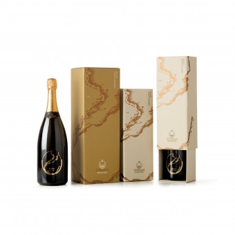
Il Mosnel Qde 2012 Sparkling Wine Label and Pack by Laura Ferrario |
Home > Winners > Design #27876 >Interview |
 |
|
FS: What is the main principle, idea and inspiration behind your design?
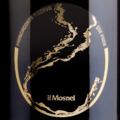
LF: This concept arises from the graphic re-elaboration of the historical image representing the shape of the lake and expresses all the power with which a freshly uncorked Reserve bottle is poured into a crystal glass. Just as the Iseo Lake splashes on the banks of Franciacorta, so the sparkling wine wets the sides of a glass. The little bubbles mix in the jet of the sparkling wine and create an expectation, an emotion that awakens a desire to open the bottle.
FS: What has been your main focus in designing this work? Especially what did you want to achieve?
LF: Usually labels are only graphical and my aim was to find a concept that would combine the territory and the product.
FS: What are your future plans for this award winning design?
LF: This project was born in the context of a competition: every year the wine farm “il mosnel” selects six Italian graphic designers who have to propose a design, and mine was chosen as the winning design for 2012. It has already won two more prizes and therefore I hope that all this promotion will allow my office to become known also abroad.
FS: Why did you design this particular concept? Was this design commissioned or did you decide to pursuit an inspiration?
LF: The “Client” gave me a briefing, but the concept that was later developed was my idea.
FS: Who is the target customer for his design?
LF: Sophisticated people and connoisseurs who are attracted by particular and innovative objects.
FS: What sets this design apart from other similar or resembling concepts?
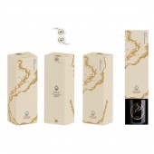
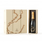
LF: Usually labels for sparkling wine follow classic standards, and my idea, apart from proposing a very precise concept, was that of finding an innovative solution also in graphical terms: an elegant and lively label which is balanced in its graphics, colors and in the combination with a modern and important font like Anorak, round and rigorous, which blends in perfectly, yet remains distinct, from the original and modern elements of the label. I chose a support in transparent polypropylene and hot foil gold printing to convey new sensations and enhance the simplicity and elegance of the product. The powerful pouring out of the sparkling wine is underlined on the box, where the graphics wraps around the packaging: simple and impactful, composed by two “Slive et Tiroir” elements which make up a precious case. A casket holding all the expectations of the Reserve: sealed with a particular gift tag showing the QdE mark to assert the prestige of the product.
FS: How did you decide to submit your design to an international design competition?
LF: I would like to use my creativity and professionalism also in non-Italian projects and this seemed to be the most immediate way to makes myself known outside my own country.
FS: Thank you for providing us with this opportunity to interview you.
A' Design Award and Competitions grants rights to press members and bloggers to use parts of this interview. This interview is provided as it is; DesignPRWire and A' Design Award and Competitions cannot be held responsible for the answers given by participating designers.
| SOCIAL |
| + Add to Likes / Favorites | Send to My Email | Comment | View Press-Release | Translations |


