| THE AWARD |
| CATEGORIES |
| REGISTRATION |
| SUBMIT YOUR WORK |
| ENTRY INSTRUCTIONS |
| TERMS & CONDITIONS |
| PUBLICATIONS |
| DATES & FEES |
| METHODOLOGY |
| CONTACT |
| WINNERS |
| PRESS ROOM |
| GET INVOLVED |
| DESIGN PRIZE |
| DESIGN STORE |
| THE AWARD | JURY | CATEGORIES | REGISTRATION | PRESS | WINNERS | PUBLICATIONS | ENTRY INSTRUCTIONS |
Equia Keto Line Packaging Identity by Joumana Maalouf |
Home > Winners > Design #159746 >Interview |
 |
|
FS: What is the main principle, idea and inspiration behind your design?
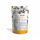
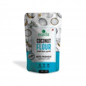
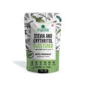
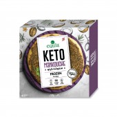
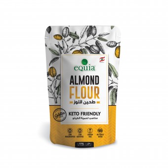
JM: The packaging design integrates old-world charm with modern aesthetics, drawing inspiration from the natural essence of the products. It emphasizes the unprocessed qualities of almond flour, coconut flour, stevia, and erythritol sweetener. By combining traditional sketches with contemporary patterns, the design portrays the products' heritage while presenting a fresh, innovative appearance, appealing to a modern, health-conscious audience.
FS: What has been your main focus in designing this work? Especially what did you want to achieve?
JM: Our main focus in designing the eQuia Keto line was to blend traditional elements with modern abstract patterns, creating a fresh and engaging identity. We aimed to achieve simplicity and functionality, using vivid natural colors to convey healthiness and unprocessed quality. Key features include user-friendly tiered notching, a seamless zipper bag opening, and compliance with FDA international regulations for global exportation.
FS: What are your future plans for this award winning design?
JM: We plan to refine and innovate our design features to ensure they continuously enhance functionality and user experience.
FS: How long did it take you to design this particular concept?
JM: The project started on July 15, 2021, and ended on November 5, 2021, in Lebanon
FS: Why did you design this particular concept? Was this design commissioned or did you decide to pursuit an inspiration?
JM: This design concept was a deliberate decision based on the strategic goals for this product line. The client, a leading food company, had commissioned us to develop packaging that would help their new keto-friendly almond flour stand out and resonate with their target health-conscious consumers. We decided to pursue a design inspiration that would highlight the premium, natural qualities of the product. The clean, minimalist aesthetic paired with earthy tones and prominent keto claims conveys a sense of quality and authenticity that would appeal to the keto audience. This design direction resulted from an iterative process, where we presented multiple concepts to the client and gathered feedback to refine the final solution. The concept for the eQuia Keto line was born out of a pursuit of inspiration, blending traditional elements with modern abstract patterns to create a compelling identity. Our design focuses on simplicity, functionality, and a vibrant natural color palette. We prioritized user experience with features like tiered notching and a seamless zipper opening mechanism. Drawing inspiration from nature and heritage, our design seamlessly merges old-world charm with contemporary aesthetics, reflecting tradition and modernity. The color palette, inspired by nature's hues, aims to provide a visually appealing and harmonious experience, enriching consumers' daily lives with a sense of well-being.
FS: Is your design being produced or used by another company, or do you plan to sell or lease the production rights or do you intent to produce your work yourself?
JM: This design, developed in-house by the Colorcode team for our esteemed client, Global Foods, has been tailored with precision and care to meet their specific requirements. It is now being distributed across the Middle East.
FS: What made you design this particular type of work?
JM: The primary driver for this design was creating packaging that would stand out on the shelves and effectively communicate the keto-friendly and premium nature of the almond flour product. Given the growing popularity of the keto diet, we knew it was important to develop packaging that would immediately grab the attention of health-conscious consumers seeking high-quality, low-carb ingredients.
FS: Where there any other designs and/or designers that helped the influence the design of your work?
JM: The keto design project combines traditional and innovative elements to develop a distinctive product line in the keto market. By conducting thorough market analysis and competitor research, the project identifies opportunities for differentiation. Consumer research guides the design process to align with customer expectations, with a strong emphasis on innovation using modern technologies. The project also explores global markets to tailor the keto line for diverse audiences. The collaborative design process involves prototyping and testing to create a unique and successful product line that meets current market demands and anticipates future trends.
FS: Who is the target customer for his design?
JM: The target audience for this design encompasses health-conscious individuals of both genders, ranging from fitness enthusiasts dedicated to achieving optimal performance to busy professionals striving for a harmonious work-life balance. Additionally, it caters to wellness-minded consumers who prioritize convenience and effectiveness in their lifestyle choices.
FS: What sets this design apart from other similar or resembling concepts?
JM: The eQuia Keto line stands out by seamlessly integrating old-world charm and modern aesthetics. While many designs may focus solely on either tradition or innovation, the eQuia Keto line strikes a unique balance between the two, leveraging traditional sketches alongside contemporary patterns to create a visually engaging identity. Its emphasis on unprocessed qualities, natural colors, and user-friendly features like tiered notching and seamless zippers prioritizes both functionality and aesthetic appeal, making it stand out in the market. It appeals to a modern, health-conscious audience seeking heritage and innovation in its products.
FS: How did you come up with the name for this design? What does it mean?
JM: The name "Keto Line" was a deliberate choice that aligns perfectly with the design concept and target market for this almond flour packaging. As a design agency, we put a lot of thought and research into developing a name that would effectively communicate the product's key selling points to health-conscious consumers. The "Keto" portion of the name directly signals that this almond flour is tailored for the keto diet, a dietary approach that has gained significant popularity in recent years. This immediately lets the target audience know that this product fits their specific lifestyle and nutritional needs. The word "Line" conveys that this almond flour is part of a broader product offering, hinting at the potential for additional keto-friendly items to come under this brand umbrella. This helps establish the Keto Line as a cohesive, specialized product category within the client's overall portfolio. Collectively, the name "Keto Line" strikes the perfect balance of being clear, concise, and highly relevant to the target consumer. It seamlessly aligns with the design aesthetic, which heavily emphasizes the keto-friendly attributes through prominent callouts and a clean, natural look and feel.
FS: Which design tools did you use when you were working on this project?
JM: As a leading design agency, we utilized Adobe Illustrator and Photoshop to develop the Keto Line packaging. These tools were essential for creating high-quality graphics and layouts, ensuring a cohesive and impactful design that met the client's objectives and earned industry recognition.
FS: What is the most unique aspect of your design?
JM: The eQuia Keto line uniquely marries tradition with a modern European twist, presenting a visually striking identity. By seamlessly blending classic elegance with contemporary aesthetics, it captures attention and resonates with today's discerning consumers. With user-friendly features such as tiered notching and a seamless zipper, it ensures both style and functionality, appealing globally to those who appreciate the fusion of tradition and modern flair in their lifestyle choices.
FS: Who did you collaborate with for this design? Did you work with people with technical / specialized skills?
JM: We have a wealth of experience creating impactful packaging solutions for clients in the food and beverage industry. In developing the design for this award-winning almond flour bag, we leveraged our team’s extensive knowledge of design trends and consumer behavior. While we looked to successful products in the natural foods space for high-level inspiration, a key part of our process involved collaborating with our in-house team of experienced packaging designers. This allowed us to combine our agency’s creative expertise with a deep understanding of the target market and design best practices.
FS: What is the role of technology in this particular design?
JM: eQuia Keto leverages cutting-edge technology to craft its line of visually appealing and easy-to-use products. The key elements include a pouch bag design, creating an easy-to-use open zipper bag for closure, tier notches for added functionality, a special printing effect on a matte background, and the incorporation of spot UV detailing. Technology is essential in crafting eQuia Keto's line, enriching both form and function. Sophisticated design software seamlessly blends tradition with modernity, facilitating innovations like tiered notching and seamless zippers. Digital tools guarantee precise color reproduction, capturing the essence of our products. Overall, technology is pivotal in achieving the perfect harmony of aesthetics and usability in eQuia Keto's designs.
FS: Is your design influenced by data or analytical research in any way? What kind of research did you conduct for making this design?
JM: The keto design project relies heavily on data and research to develop a winning product line. Market analysis and competitor research ensure differentiation, while consumer research ensures the design aligns with customer expectations. This data-driven approach, including market size, competitor analysis, target audience demographics, and emerging trends, helps create a unique and successful product.
FS: What are some of the challenges you faced during the design/realization of your concept?
JM: Two main challenges arose during the design phase. First, we needed to integrate three languages into the interface seamlessly. This meant following the brand's guidelines while still achieving a modern look. Second, the design had to be both simple and elegant, while also fitting a lot of information. We basically aimed to create a high-end user interface that was easy to use even with a substantial amount of content.
FS: How did you decide to submit your design to an international design competition?
JM: Our participation in the international design competition with the eQuia Keto line was a strategic decision to cultivate brand awareness and propel our design expertise onto the global stage. This platform provided the ideal opportunity to showcase our innovative approach of harmonizing traditional elements with cutting-edge, abstract patterns. By presenting this forward-thinking design to a discerning international audience, we aspired to not only garner recognition for our creative vision but also to potentially influence and inspire design trends within the industry.
FS: What did you learn or how did you improve yourself during the designing of this work?
JM: One of the key things we learned during this process was the importance of deeply understanding the target audience and their specific needs. Through extensive market research and analysis, we gained invaluable insights into the mindset and preferences of health-conscious, keto-focused consumers. Additionally, collaborating closely with the client and getting frequent feedback helped us improve the design and perfect the details. Most importantly, the project reinforced the power of creativity and innovation.
FS: Any other things you would like to cover that have not been covered in these questions?
JM: Thank you for this opportunity to showcase our eQuia Keto design. It's not just about the packaging; it serves as a bridge between tradition and fresh ideas. It demonstrates how design can elevate a product, narrate stories, and inspire. This marks the beginning of a future in packaging that honors heritage while embracing innovation. We envision a world where each product tells a story of timeless progress.
FS: Thank you for providing us with this opportunity to interview you.
A' Design Award and Competitions grants rights to press members and bloggers to use parts of this interview. This interview is provided as it is; DesignPRWire and A' Design Award and Competitions cannot be held responsible for the answers given by participating designers.
| SOCIAL |
| + Add to Likes / Favorites | Send to My Email | Comment | View Press-Release |

