| THE AWARD |
| CATEGORIES |
| REGISTRATION |
| SUBMIT YOUR WORK |
| ENTRY INSTRUCTIONS |
| TERMS & CONDITIONS |
| PUBLICATIONS |
| DATES & FEES |
| METHODOLOGY |
| CONTACT |
| WINNERS |
| PRESS ROOM |
| GET INVOLVED |
| DESIGN PRIZE |
| DESIGN STORE |
| THE AWARD | JURY | CATEGORIES | REGISTRATION | PRESS | WINNERS | PUBLICATIONS | ENTRY INSTRUCTIONS |
Unicorn Rebrand Visual Identity by YATING LIU |
Home > Winners > Design #154412 >Interview |
 |
|
FS: What has been your main focus in designing this work? Especially what did you want to achieve?
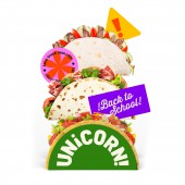
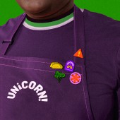
YL: This is a rebranding project for Unicorn Taco, a New York-based taco brand specializing in Mexican food. The design features a lively and bold color palette, complemented by badge graphics that resonate with the college student identity. These elements work together to create a more enticing brand image, appealing to a youthful audience.
FS: What are your future plans for this award winning design?
YL: After winning the award, I will reach out to various media outlets to publicize my achievement and share my creative philosophy with a wider audience. I also hope to connect with like-minded designers through this exposure. Additionally, I plan to participate in several exhibitions, which is an excellent way to promote my work and meet designers from around the world.
FS: How long did it take you to design this particular concept?
YL: I spent approximately six months completing this work. Of course, I didn't work on it every day; the process included brainstorming the name, designing the logo, and making numerous adjustments and revisions along the way.
FS: Who is the target customer for his design?
YL: College student in New York City
FS: How did you come up with the name for this design? What does it mean?
YL: "Unicorn" carries a dual meaning: it represents the mythical creature "Unicorn," aligning with the brand's weekly flavor launches, and can also be split into "Uni" and "CORN," symbolizing "university" (as the food truck targets college students near universities) and "the taco." The exclamation mark at the end of the logo mimics the third letter "i," a distinctive punctuation mark in Spanish.
FS: Which design tools did you use when you were working on this project?
YL: I primarily used Adobe Illustrator and Photoshop to complete this work.
FS: What is the most unique aspect of your design?
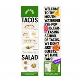
YL: The design showcases a vibrant and bold color palette, enhanced by badge graphics that resonate with the identity of college students. These elements collaborate to craft a more appealing brand image for a youthful audience. Moreover, each product name in the menu design cleverly incorporates terms closely related to college life, such as "all-nighter," "group project," and "brainstorm," ensuring that every aspect of the design is closely tied to the brand's core, ultimately creating a cohesive and unified visual system.
FS: What are some of the challenges you faced during the design/realization of your concept?
YL: The challenge of this brand design is to ensure that every element is closely connected to the brand's core, resulting in a cohesive and unified visual system. For instance, the logo design effectively integrates various pieces of information—such as the brand's origin, product characteristics, and target audience—into a simple yet unique and detailed graphic.
FS: Thank you for providing us with this opportunity to interview you.
A' Design Award and Competitions grants rights to press members and bloggers to use parts of this interview. This interview is provided as it is; DesignPRWire and A' Design Award and Competitions cannot be held responsible for the answers given by participating designers.
| SOCIAL |
| + Add to Likes / Favorites | Send to My Email | Comment | View Press-Release |


