| THE AWARD |
| CATEGORIES |
| REGISTRATION |
| SUBMIT YOUR WORK |
| ENTRY INSTRUCTIONS |
| TERMS & CONDITIONS |
| PUBLICATIONS |
| DATES & FEES |
| METHODOLOGY |
| CONTACT |
| WINNERS |
| PRESS ROOM |
| GET INVOLVED |
| DESIGN PRIZE |
| DESIGN STORE |
| THE AWARD | JURY | CATEGORIES | REGISTRATION | PRESS | WINNERS | PUBLICATIONS | ENTRY INSTRUCTIONS |
Adore Repackaging Sanitary Pads by Etereo |
Home > Winners > Design #101113 >Interview |
 |
|
FS: What is the main principle, idea and inspiration behind your design?
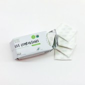
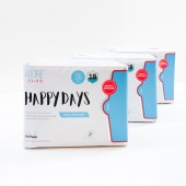
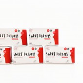
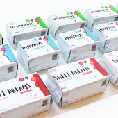
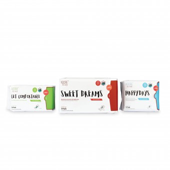
EP: ADORE is designed for the modern woman who is independent, professional and confident. ADORE new look is chic in its simplicity and yet functional in its clean design.
FS: What has been your main focus in designing this work? Especially what did you want to achieve?
EP: Our main focus for this project is to create a design that appeals to modern females today. We aim to keep the design trendy while keeping it minimalist. To do so, we used the Typeface as the main design element for this project.
FS: What are your future plans for this award winning design?
EP: We would like to expand this design concept to the other range of ADORE’s brand, to reinforce her brand identity across her products.
FS: How long did it take you to design this particular concept?
EP: The whole process from conceptualisation to execution took about 6 months. Design concept took about half of the project length. The project started in November 2018 and was launched in Islandwide in Singapore in April 2019.
FS: Why did you design this particular concept? Was this design commissioned or did you decide to pursuit an inspiration?
EP: We are commissioned by ADORE to recreate a new packaging experience, accompanied by a rebranding strategy to strengthen her brand positioning.
FS: Is your design being produced or used by another company, or do you plan to sell or lease the production rights or do you intent to produce your work yourself?
EP: This new packaging of ADORE has already been launched islanding wide in Singapore in April 2019.
FS: What made you design this particular type of work?
EP: As a Creative Brand Agency, we believe that good packaging design plays an important role in branding your products and differentiate yourself from your competitors. We would say that we helped our client to stay ahead of the competition, and Packaging design is one of the ways that we can help them to do so.
FS: Where there any other designs and/or designers that helped the influence the design of your work?
EP: No. We developed the design based on the discussion with the ADORE Product Manager and through a survey that has been conducted on modern females, to better understand the preference in design for sanitary packaging. We took into account the design of Competitors’ brands to ensure that our design will stand out among them.
FS: Who is the target customer for his design?
EP: Modern females, inclusive but not limited to office ladies, mothers and students.
FS: What sets this design apart from other similar or resembling concepts?
EP: The Typeface used. To characterize ADORE, we used Aloja, a handwritten font to recreate a sense of youth and vibrancy. The overall design is minimal against a plain background to draw attention to the product benefits which ADORE wants to focus - feminine health! It is the first in the market to use a loud and fun font as the core design element on the packaging.
FS: How did you come up with the name for this design? What does it mean?
EP: ADORE is the brand name of the product. It also means to ADORE yourself and provide yourself with the best feminine care that you deserve!
FS: Which design tools did you use when you were working on this project?
EP: Adobe Creative Suites
FS: What is the most unique aspect of your design?
EP: The simplicity of the design and just focusing on the typeface to create this design.
FS: Who did you collaborate with for this design? Did you work with people with technical / specialized skills?
EP: We worked in with our design team in the conceptualisation of this project, through various rounds of research and discussions. We also worked closely with the Product Manager of ADORE in the development of this Packaging Design to better understand ADORE’s target audience. It takes strong teamwork and hard work from the members to have this project realised.
FS: What is the role of technology in this particular design?
EP: The ADORE product is developed by her very own breakthrough technology that features green compound strips bonded with far-infrared rays and nano ag to eliminate bacteria. Every material and component of ADORE Sanitary pads are carefully selected and sourced from Japan, Korea and Malaysia. The sanitary pads packaging is designed as a fully sealed aluminium packaging with re-sealing ability, with the goal of keeping the sanitary pads germs and bacteria-free.
FS: Is your design influenced by data or analytical research in any way? What kind of research did you conduct for making this design?
EP: A survey has been conducted on this group of females, to better understand the preference in design for sanitary packaging. From our survey results, we researched and expanded our design concepts based on what interests the target audience most.
FS: What are some of the challenges you faced during the design/realization of your concept?
EP: The challenge is to design an entirely new look for ADORE while at the same time, maintaining ADORE's strong brand recognition among her loyal customer base. Another challenge is to ensure the dimensions for the design will be sustainable and viable. While working on the prototype to ensure that the measurements are workable, we printed the artwork on poster-sized Artcards and folded them into boxes to test on the functionality. After rounds of adjustments and refinements on the designs, we then finalised on the right sizings to fit in the required pads and proceed with mass production.
FS: How did you decide to submit your design to an international design competition?
EP: We are very proud of how ADORE’s Packaging turns out to be and would like to take this opportunity to have our work presented to the Global community. To have more people know about etereo and Adore.
FS: What did you learn or how did you improve yourself during the designing of this work?
EP: Packaging Design is not just about being visually attractive, it has to be functional and sustainable. To accomplish this, it requires a high level of patience and perseverance to get through the numerous rounds of amendments and test printings.
FS: Any other things you would like to cover that have not been covered in these questions?
EP: NA
FS: Thank you for providing us with this opportunity to interview you.
A' Design Award and Competitions grants rights to press members and bloggers to use parts of this interview. This interview is provided as it is; DesignPRWire and A' Design Award and Competitions cannot be held responsible for the answers given by participating designers.
| SOCIAL |
| + Add to Likes / Favorites | Send to My Email | Comment | View Press-Release |

