DESIGN NAME:
Shaping
PRIMARY FUNCTION:
Studio
INSPIRATION:
For us, creative office space should be bright, spacious and comfortable.
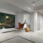
The vision of light flow can be used to enlarge the space. The method of shrinking the entrance space to maintain a part of the rest environment, to provide a buffer for the creative space and eliminate the sense of oppression in the narrow space.
UNIQUE PROPERTIES / PROJECT DESCRIPTION:
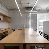
Due to space constraints, the narrow and long pattern is prone to dark oppression and fragmented movement, which is a subjective limitation. In order to make the creative space smooth, Analyze the single-sided lighting and the pattern of narrow and long planes. Using the characteristics of the straight lines of light, and guide the light to the space moderately and observe how the light penetrates the path in the narrow field.
OPERATION / FLOW / INTERACTION:
The vision of light flow can be used to enlarge the space. Using the method of shrinking the entrance space to maintain a part of the rest environment, to provide a buffer for the creative space and eliminate the sense of oppression in the narrow space
PROJECT DURATION AND LOCATION:
The project started in April 2019 and finished in June 2019 in Taipei,Taiwan.
FITS BEST INTO CATEGORY:
Interior Space and Exhibition Design
|
PRODUCTION / REALIZATION TECHNOLOGY:
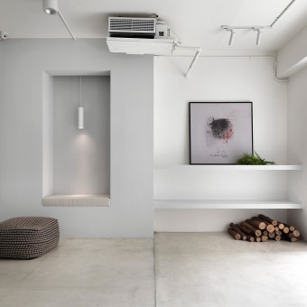
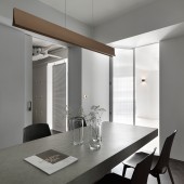
In terms of material design, Continue the spirit of modern architecturalism, letting "the original form is a beautiful form" run through the whole, simple and elegant facade and exquisite craftsmanship, so that white color theme is chosen.
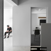
In addition, it make the wall transparent by simplifying the selection. Glass folding doors and perforated iron pieces were utilized so that openness are not disturbed by closed meeting spaces, so public areas According to the situation, it can become a paragraph on the moving line, so that each space can express different functional aspects.
SPECIFICATIONS / TECHNICAL PROPERTIES:
This project is about 115 square meters, based in Taipei City.
TAGS:
Studio, Personal Studio, Small Office, Work Place
RESEARCH ABSTRACT:
"The original form is a beautiful form" is the key concept for the design. Making this space full of simplicity while expressing elegance and exquisite craftsmanship, so that white color is chosen to be exposed on the facade and the beams. The crisscross of vertical and horizontal facade constructs the simplicity and purity of the shape, as the concepts of "form follows", "truth to materials", and "less is more" realization.
CHALLENGE:
Simplicity and penetration are the most important annotations of this space. In the conversion of perception into spatial shaping, the limitations of hue, material and light are integrated, and finally the problems of shady light and space function are solved.
ADDED DATE:
2020-02-15 10:00:16
TEAM MEMBERS (2) :
MAGGIE YU and HUANG MING WEI
IMAGE CREDITS:
Moooten Studio
|
