DESIGN NAME:
Shiny White Box
PRIMARY FUNCTION:
Residential
INSPIRATION:
When the client and her mother moved to another city, they always missed the opportunity to return to their hometown. Therefore, this project is proposed to be the warm place that provides them with the home feeling. The design style of the house presents the preferences and expectations of two different generations, which aims to achieve the full functional needs in the small and delicate space, but still to ensure the utilization of the space is easy and flexible.
UNIQUE PROPERTIES / PROJECT DESCRIPTION:
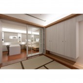
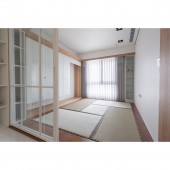
This project is an elderly house prepared by the client to support her mother. Since the elder has a strong nostalgic feeling with a Japanese style building where they had lived before, the client requested a white and simple modern style building. The design team combines those two design elements by changing the pattern, materials, and colors. Meanwhile, the design team solved the windy characteristics of the site and the humid and cold weather problems, creating harmony and comfort.
OPERATION / FLOW / INTERACTION:
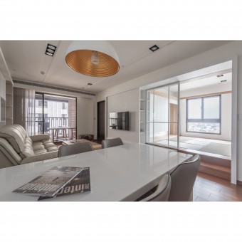
Removing one wall from the original bedroom and replaced it with a movable aluminum frame glass sliding door to improve indoor daylight, and giving better access to see the landscape view outside. It also solved the humidity and cold condition problems of the house and makes this room into a Japanese style room as the clients mother wanted. When necessary, this room can turn into a private multifunctional room by pull down the hidden roller blinds.
PROJECT DURATION AND LOCATION:
The project was completed in March, 2019 in Hsinchu City, Taiwan.
FITS BEST INTO CATEGORY:
Interior Space and Exhibition Design
|
PRODUCTION / REALIZATION TECHNOLOGY:
Artificial stone, wallpaper, artificial leather, padded headboard cover, pure white painted glass, enamel paint, aluminum frame door, timber floor, tatami mat, enamel coating system furniture.
SPECIFICATIONS / TECHNICAL PROPERTIES:
The actual space of the interior design is approximately 52 square meters.
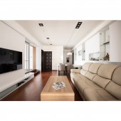
The layout includes the entrance, living room, island dining area, kitchen, Japanese tatami room, master bedroom and shared bathroom.
TAGS:
Modern, Japanese style, open space, white, Minimalism, residential design
RESEARCH ABSTRACT:
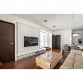
To bring out the layers of different textures, the design team use materials to create lines with visual extension effects. For example, artificial stone lines are used on the entrance hallway wall to correspond to the stone-shaped door frames of the TV wall and the entrance of the room. Moreover, the originally closed layout was turned into the Japanese-style room as an open area, make the area more flexible.
CHALLENGE:
Due to the special climate of the site environment and the condition of the original building, the high indoor humidity and insufficient lighting in this house are the main issues. After the solid wall from one of the rooms was removed, lighting and views were finally able to be introduced inside. However, this reduced the size of the TV wall. Therefore, how to perfectly connect the TV wall and the entrance of the Japanese room to avoid visual compression has become the challenge of the design.
ADDED DATE:
2020-01-31 09:10:35
TEAM MEMBERS (2) :
Tzu-Yi Yang and Chun-Chun Yang
IMAGE CREDITS:
Chien-Tao Chen
|


