Asian Paints Ezycolour Tool Web Application by Lollypop Design Studio |
Home > |
 |
|
||||
| DESIGN DETAILS | |||||
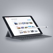
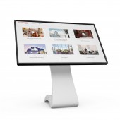
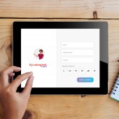
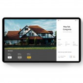
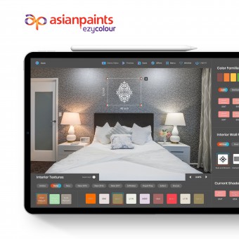
| DESIGN NAME: Asian Paints Ezycolour Tool PRIMARY FUNCTION: Web Application INSPIRATION: Ezycolor tool aims to colour a zillion dreams. It is an easy to use tool by contractors, dealers, painters and end users from the tier 2 and tier 3 cities in India; the app aims to help people visualize the colour of their dream house before actually investing their hard earned money. We researched in over 10 cities in India to understand the pain points and motivations. Being a kiosk design, it had different challenges but a chance to spread million smiles pushed us to design the ezycolour tool UNIQUE PROPERTIES / PROJECT DESCRIPTION: Ezycolour educates and empowers users about the painting cycle. It builds on trust by allowing for realistic visualization of colours with a single click. For the builders, and painters it serves as a guide for new products and also helps explain the process to their users. Ezycolour is multilingual and has video guides to ease understanding. Designs are inclusive and follow W3C principles. Tool is equally intelligent as it is able to give suggestions depending on users taste and needs. OPERATION / FLOW / INTERACTION: The tool allows for visualization within just five easy simple steps. It cuts all the clutter and focuses on singular goal of providing hassle free colour visualization tool. We have intensive sorting and filtering options for ease in use while also facilitating intelligent suggestion system. A mascot was designed to eliminate the middlemen and to emote with the users. It converses with users and explains the benefits and challenges of each type of colour along with costs and timelines. PROJECT DURATION AND LOCATION: We started the project on April 2018 and ended in December 2018 in India. FITS BEST INTO CATEGORY: Interface, Interaction and User Experience Design |
PRODUCTION / REALIZATION TECHNOLOGY: We used contextual interviews, questionnaires, and one on one user interviews during the research process. Card sorting techniques helped us during the user flow and user journeys; Sketch software was used for high fidelity wireframess while photoshop was used primarily for ui designs. Invision was used for prototyping. SPECIFICATIONS / TECHNICAL PROPERTIES: We designed UX, UI for the Kiosk. TAGS: Design, UX, UI, colourkiosk, consumer goods, kiosk design, Digital Design RESEARCH ABSTRACT: Research spanned over a month across 10 (tier 2 & 3) cities in India. Based on user behaviours and attitudes, the primary audience were classified into Pragmatic and Emotionally invested end users. While painters, contractors, and dealers were the secondary audience. We conducted contextual and one on one interviews. The insights gave us an in-depth understanding that the tool had to be accessible, intelligent, easy to use, and users should be able to emote and trust the tool. CHALLENGE: The two major challenges at hand were to ensure accessibility and to establish a sense of trust. Our designs follow W3C principles and works well on touch screen; tool is multilingual and provides voice guides, video tutorials, intelligent suggestions, and can be shared easily on communication channels. The whole tool is broken into simple five steps. For establishing emotional connect we introduced mascot that aims to educate users and provide information on colours, budgets, and timelines. ADDED DATE: 2019-10-15 07:11:22 TEAM MEMBERS (5) : Sathish N – Lead UI, Shrutkirti Saksena – UX Researcher Lead, Giridara M – UI Designer, Tamilselvan - Animator and Soundarya Kanthan – Project Manager IMAGE CREDITS: The Images used are free stock Images. Following are the link to their license section - 1. https://unsplash.com/license 2. https://www.pexels.com/photo-license/ PATENTS/COPYRIGHTS: The Images used are free stock Images. Following are the link to their license section - 1. https://unsplash.com/license 2. https://www.pexels.com/photo-license/ |
||||
| Visit the following page to learn more: https://www.lollypop.design | |||||
| AWARD DETAILS | |
 |
Asian Paints Ezycolour Tool Web Application by Lollypop Design Studio is Runner-up for A' Design Award in Interface, Interaction and User Experience Design Category, 2019 - 2020.· Read the interview with designer Lollypop Design Studio for design Asian Paints Ezycolour Tool here.· Press Members: Login or Register to request an exclusive interview with Lollypop Design Studio. · Click here to register inorder to view the profile and other works by Lollypop Design Studio. |
| SOCIAL |
| + Add to Likes / Favorites | Send to My Email | Comment | Testimonials |


