DESIGN NAME:
Timeless
PRIMARY FUNCTION:
Residence
INSPIRATION:
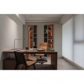
The male client, who is a surgeon, requires a study for himself to read and write. The female client wishes the living environment is of hotel-like quality to fulfill the need of the family to stay relaxingly as if in a resort. The other focus is the son bedroom which the clients wish to provide for the son to stay until adulthood and do not need much renovation in future. Thus, the spatial design has fulfilled the durability and usability of a long-term residence.
UNIQUE PROPERTIES / PROJECT DESCRIPTION:
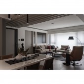
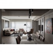
The partition between bedrooms is reconstructed. Besides glass material, segments of lines wall decoration to break the narrow visual sense. Beams are covered by wooden decorative grilles, paint and veneer are used on the ceiling to reduce visual interference caused by big beams. Merging sculpture art display and beveled bedroom door into the TV wall increases the sense of extension. Floor tiles of the kitchen are connected with the living room at an angle form the flow guidance.
OPERATION / FLOW / INTERACTION:
The original ceiling height of the public area is only 2.85m while the ceiling height of the dining area is 3.4m, which is of an obvious difference. Large beams have also created a strong visual pressure. The designer has used vertical wooden grilles, veneer and grey spray paint to solve this issue. The upper part of the partition wall between the living room and study is made of glass and the main axis of the TV wall extends to the bedroom entrance create a widening effect.
PROJECT DURATION AND LOCATION:
The project started in June, 2017 and completed in August, 2018 in Taipei, Taiwan.
FITS BEST INTO CATEGORY:
Interior Space and Exhibition Design
|
PRODUCTION / REALIZATION TECHNOLOGY:
The design has a widely used earth color tone veneer, is covered by dark mirror material which also acts as a dressing mirror. The bedhead of the master bedroom uses customized leather-like material, matches with titanium-plated metal frames as segmentation creating a simple yet fashionable style. The TV wall is painted of Italian brand mineral paint, creating an effect of stone texture. Each space uses different custom made furniture to bring out the modern elegance.
SPECIFICATIONS / TECHNICAL PROPERTIES:
The overall area is 106 square meters. The minimalist study can also function as a guest room. With amber LED strip lighting, the cabinet wall becomes a vogue visual focus. Simple designed desk matches with orange leather office chair and wooden floor, adding warmth into the space. Modern style son bedroom uses grayish blue as the color tone, is suitable to accommodate the client even till adulthood. Due to great day-lighting, cooler colors are applied to reconcile the brightness of the space.
TAGS:
Understated luxury, calmness, elegance, modern, ample colour, leather, layout transformation
RESEARCH ABSTRACT:
It is originally a half-finished apartment which is bought by the clients to provide a better living environment for their son. The clients, who have once only preferred black and white colour tone, give full trust to the designer in the application of colours, leather, wood and other elements. With the full support of the clients, a warm and modern living environment is successfully realized by the designer and the construction team.
CHALLENGE:
The beams of the original layout are over-sized, thus, the vertical segmentation, veneer and paints are used to create layering effect to reduce the sense of pressure. Besides, the chaotic fire sprinkler and pipelines appeared on the original ceiling of the house plus the installation of air-condition, adding challenges to the construction. The design solution has successfully overcome those issues via excellent design and construction quality.
ADDED DATE:
2019-10-01 09:05:31
TEAM MEMBERS (1) :
Chia-Chi Yeh
IMAGE CREDITS:
Image #1: Mark Hsu
Image #2: Mark Hsu
Image #3: Mark Hsu
Image #4: Mark Hsu
Image #5: Mark Hsu
|


