DESIGN NAME:
CompostED
PRIMARY FUNCTION:
Educational Campaign
INSPIRATION:
The recycling movement has been growing since the 70's, but only recently has the importance of recycling of food waste come to light. Because food waste is a potent pollutant that most people contribute to, it is essential to teach about sustainable living. CompostED educates about the processes and benefits of composting as an alternative to throwing out food waste. Engaging this sustainable learning with school curricula encourages people to be involved with composting from a young age.
UNIQUE PROPERTIES / PROJECT DESCRIPTION:
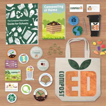
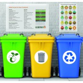
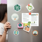
CompostED collaborates with educational communities to inspire sustainability and educate about the natural process of food and plant recycling through composting. The goal is to raise upcoming generations with a concern for where food may end up when they are done with it and to take a first step towards sustainable thinking and waste reduction. This is achieved through the effective research and design of engaging and informative booklets, flyers, posters, and interactive "stuff we all get."
OPERATION / FLOW / INTERACTION:
The target audience is school community and outreaches not only to staff and students, but also to families of students and their local communities. Compost is the ideal solution to food waste for this project because it allows students to learn first-hand about environmental science, chemistry, sociology, economics, art, mathematics, and communication in a learning environment. Compost also turns waste into a valuable product that students can use to beautify their campus and gardens.
PROJECT DURATION AND LOCATION:
This project started in January 2018 and finished in February 2019. It was done from Farmville, VA and involved research from across the world. This project was exhibited in the Point of Departure gallery for senior BFA students at the LCVA in Farmville, April 13 to May 15, 2019.
FITS BEST INTO CATEGORY:
Social Design
|
PRODUCTION / REALIZATION TECHNOLOGY:
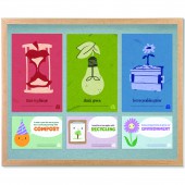
There was a lot of experimentation to decide on a medium for the visual systems of this brand identity. For example, I had a series of strong conceptual brute-think posters and tested them in photo manipulation, illustration, and finally paper cut, which had an appropriately organic quality to it and allowed the concepts to shine.
The texture of the logo was achieved by making potato stamps from sprouting potatoes before composting, serving as an example of creative ways to recycle food.
SPECIFICATIONS / TECHNICAL PROPERTIES:
All posters are 279.4 x 431.8 mm, booklet is 203.2 x 254 mm, and bi fold folder folded along the dotted line is 139.7 x 215.9 mm. The seed paper is 101.6 x 101.6 mm and handmade from recycled paper and wildflower or strawberry seeds.
TAGS:
Sustainability, Education, Composting, Food waste, Graphic design
RESEARCH ABSTRACT:
My research was individual and served to identify the problem I wanted to design a solution to. Research included Ted-Talks, documentaries, articles, books, websites, similar projects, and contacting individuals. I learned about food waste statistics, school and university contribution to food waste, how much food the average school throws out each week, different types of composting, and what is compostable or not. Such insights helped refine goals and target audience and to write informational content.
CHALLENGE:
It was challenging doing this project on my own where being part of a team would have been optimal. I was overwhelmed by the amount of research and faced indecisiveness, lack of motivation, and self-doubt. I overcame these by experimenting, being organised and making outlines, and getting criticism from other designers and writers at my school. I also had to keep refining my project to be practical because wanted my project to make it as easy as possible for schools to practice composting.
ADDED DATE:
2019-06-15 16:52:36
TEAM MEMBERS (1) :
IMAGE CREDITS:
To the best of my knowledge, the stock images I used in my images are copyright free.
|
