Pure Honey Packaging Design by Salvita Bingelyte |
Home > |
 |
|
||||
| DESIGN DETAILS | |||||
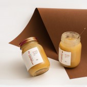
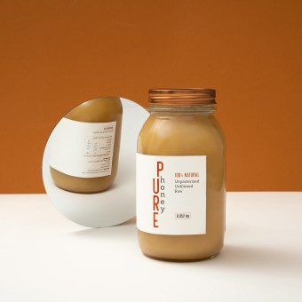
| DESIGN NAME: Pure Honey PRIMARY FUNCTION: Packaging Design INSPIRATION: If you want to enjoy the benefits derived from honey, its purity is what you need to consider when buying. Pure honey is the natural product of honey bees, made only from their natural, uninterrupted processes. All natural positioning allowed me to create a clean brand that appeals to both the stylish and health conscious alike. I combined natural materials to suit to the brands environmental credentials with a paired back aesthetic to provide a stand out appeal in an overly busy category. UNIQUE PROPERTIES / PROJECT DESCRIPTION: I created the brand and packaging for pure honey. The lettering and lines are design elements themselves, comprehensibility, transparency and clarity are all important. The design is very clean, but with character. The typography is the main element of a label design, especially because no other graphic approach was taken. I decided to put the label not in the center, but on the left side, so that the more honey texture is noticeable. It looks chic and more sophisticated in appearance. OPERATION / FLOW / INTERACTION: The new brand deploys minimal graphic elements and a decisive color palette, that reflects the purity of the ingredients. With its minimal design, simple like honey, it proselytizes a gift from Mother Nature. PROJECT DURATION AND LOCATION: Started in January 2019 and finished February 2019 in Vilnius, Lithuania. FITS BEST INTO CATEGORY: Packaging Design |
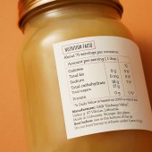
PRODUCTION / REALIZATION TECHNOLOGY: I chose Mason jars because they represent a wholesome, simpler way of life. But there is more to these jars than just their timeless aesthetic and nostalgia. They speak to our awareness of the environmental, economic, and health costs of consuming processed foods. They are reusable, durable and do not easily chip. The uses are nearly endless. To enhance the simplicity of the product, I opted for screen printed labels on a white, textured paper label. SPECIFICATIONS / TECHNICAL PROPERTIES: The label design size is 185 mm x 80 mm and 150 mm x 60 mm, on a jar holding approximately 1 l or 500 ml of honey. TAGS: Honey, packaging, honey brand, design, branding, graphic design, Salvita Design, Lithuania RESEARCH ABSTRACT: Most of the honey available in supermarkets is not natural, with many additives and impurities. By sticking to a minimalistic approach, using simple type and muted color, the design conveys the raw position of the brand. As a result, I managed to avoid the traditional honey visual cliches such as bees, drops, honeycomb and created a unique and memorable label design. CHALLENGE: To create a logo and packaging that would stand apart from the other honey on the market and easily flow to other products. ADDED DATE: 2019-03-03 09:20:01 TEAM MEMBERS (1) : IMAGE CREDITS: Salvita Bingelyte (Set Design and Prop Styling) |
||||
| Visit the following page to learn more: https://www.salvita.lt | |||||
| AWARD DETAILS | |
 |
Pure Honey Packaging Design by Salvita Bingelyte is Runner-up for A' Design Award in Packaging Design Category, 2018 - 2019.· Read the interview with designer Salvita Bingelyte for design Pure Honey here.· Press Members: Login or Register to request an exclusive interview with Salvita Bingelyte. · Click here to register inorder to view the profile and other works by Salvita Bingelyte. |
| SOCIAL |
| + Add to Likes / Favorites | Send to My Email | Comment | Testimonials |


