DesignerKangBranding Designer Identity by SeungHyun Kang |
Home > |
 |
|
||||
| DESIGN DETAILS | |||||
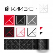
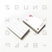
| DESIGN NAME: DesignerKangBranding PRIMARY FUNCTION: Designer Identity INSPIRATION: I wanted to advertise my work online, so I needed a symbol's logo. If you are a designer, I think you need a brand even if you are an individual. Especially if you share a lot of things online like you do now, I think the use of common form symbols and logos can help designers remember things. UNIQUE PROPERTIES / PROJECT DESCRIPTION: Identity keywords started with sharing. Sharing means to communicate, to share ideas, to talk, to design that is not unilateral. So the form is the letter KANG, which represents you. The term SHARING is used to describe two elements in a single bowl in a divided form. RED color, which is used as color, is the key color that shows your personality best. Attempt to expand identity with font development OPERATION / FLOW / INTERACTION: by using the logo When you share your work online, by using not only names, but also high-profile logos, Helps to recognize and establish designer identity. PROJECT DURATION AND LOCATION: It was first produced in June 2016 as a result of uploading work to Behance. FITS BEST INTO CATEGORY: Graphics, Illustration and Visual Communication Design |
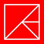
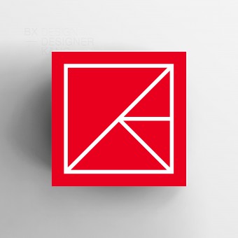
PRODUCTION / REALIZATION TECHNOLOGY: The purpose of this design is to imprint my logo when trying to publicize the design outside. I thought the form should be simple and easy. And I thought that the essence of the brand should be easily recognized. So we built the square, not the complicated lines. Made of simple lines, it is easy to form. SPECIFICATIONS / TECHNICAL PROPERTIES: It's used offline online, so it's not limited in size. I want to limit the minimum size. I want to ban offline, because online is less than 30px, and offline is not identified by less than 0.5cm Color codes are available online for R:230 G:10 B:40 Offline C:2 M:100 Y:100 K:0 Direct-made fonts consist of Light, Regular, and Bold. TAGS: BX, BI, LOGO, Symbol, Identity, Designer, Branding, Card, Graphic RESEARCH ABSTRACT: Designer Kang conceived this subject of Sharing and Kang and Design, cleverly wrapped in a square or box.Looking carefully in this box, are lines to express sharing of design ideas. And K which is an alphabet found in the name KANG represents the personal brand and brain behind this design. The lines in this boxed space are to support multilateral communication where thoughts, ideas and expressions all fit in this same space. Lastly, a bold dash of red color is applied to highlight SeungHyuns passion for design and sharing. CHALLENGE: The initial purpose is to start small, but there is a desire to develop gradually. However, there are difficulties in developing a product because it takes money. ADDED DATE: 2019-02-25 13:10:40 TEAM MEMBERS (1) : IMAGE CREDITS: SeungHyun Kang, 2018. |
||||
| Visit the following page to learn more: https://bit.ly/2U8Dl5D | |||||
| AWARD DETAILS | |
 |
Designerkangbranding Designer Identity by Seunghyun Kang is Runner-up for A' Design Award in Graphics, Illustration and Visual Communication Design Category, 2018 - 2019.· Read the interview with designer SeungHyun Kang for design DesignerKangBranding here.· Press Members: Login or Register to request an exclusive interview with SeungHyun Kang. · Click here to register inorder to view the profile and other works by SeungHyun Kang. |
| SOCIAL |
| + Add to Likes / Favorites | Send to My Email | Comment | Testimonials |


