Naober Corporate Identity by HesseShanghai,Klaus Hesse/ShenTu/JiangYi |
Home > |
 |
|
||||
| DESIGN DETAILS | |||||
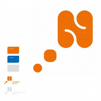
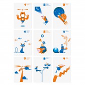
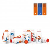
| DESIGN NAME: Naober PRIMARY FUNCTION: Corporate Identity INSPIRATION: Learning to learn. The Naober School is a private institution that has focused on promoting the learning potential of children and teenagers. With specially developed methods and training, Naober enhances students' self-confidence, memory, understanding, judgment, imagination, analytical skills and creativity. The design of the course supporting media. Each participant receives a notebook, a set of coloured pencils and a bottle for warm drinks for motivation and introduction. UNIQUE PROPERTIES / PROJECT DESCRIPTION: Naober offer a relaxed and inspiring learning environment to develop the individual abilities of girls and boys.It has already opened more than twenty schools in China.Each course of the Naober has its own number, which is based on the logo.Naober offers a nine-part course programme.The teaching units include exercises and methods to improve concentration, memory, writing and expression skills, imagination and free speech.The benefit of the courses is indicated by a key visual in a humorous way. OPERATION / FLOW / INTERACTION: - PROJECT DURATION AND LOCATION: The project started in 2017 and finished in 2018 in ChangZhou, China. FITS BEST INTO CATEGORY: Graphics, Illustration and Visual Communication Design |
PRODUCTION / REALIZATION TECHNOLOGY: - SPECIFICATIONS / TECHNICAL PROPERTIES: - TAGS: - RESEARCH ABSTRACT: - CHALLENGE: - ADDED DATE: 2019-02-24 13:02:09 TEAM MEMBERS (3) : Creative Director: Klaus Hesse, Art Direction: Shen Tu, Jiang Yi, and Animation: Lao Jialing IMAGE CREDITS: HesseShanghai,Klaus Hesse/ShenTu/JiangYi, 2018. |
||||
| Visit the following page to learn more: http://hesseshanghai.com/en/visual-ident |
|||||
| AWARD DETAILS | |
 |
Naober Corporate Identity by Hesseshanghai, Klaus Hesse/Shentu/Jiangyi is Runner-up for A' Design Award in Graphics, Illustration and Visual Communication Design Category, 2018 - 2019.· Read the interview with designer HesseShanghai,Klaus Hesse/ShenTu/JiangYi for design Naober here.· Press Members: Login or Register to request an exclusive interview with HesseShanghai,Klaus Hesse/ShenTu/JiangYi. · Click here to register inorder to view the profile and other works by HesseShanghai,Klaus Hesse/ShenTu/JiangYi. |
| SOCIAL |
| + Add to Likes / Favorites | Send to My Email | Comment | Testimonials |


