Regale Dental Clinic Innovative health center by Olga Borisova |
Home > |
 |
|
||||
| DESIGN DETAILS | |||||
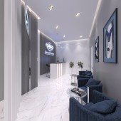
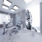
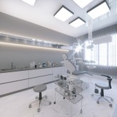
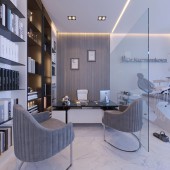
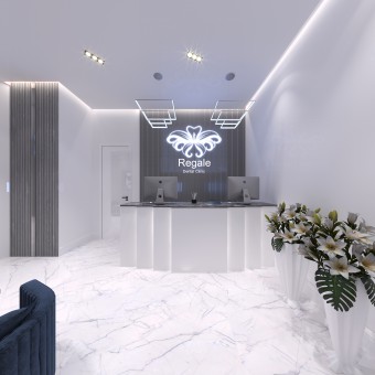
| DESIGN NAME: Regale Dental Clinic PRIMARY FUNCTION: Innovative health center INSPIRATION: My vision was to create this clinic on a bright minimalist space. I was inspired by all the bright interiors, also a personal visit to dental clinics gave me an understanding of how to do and how not to do. UNIQUE PROPERTIES / PROJECT DESCRIPTION: To create a modern Dental Clinic with innovative equipment. This is clinic has the advantage that it has everything to serve people with disabilities. As well as a separate room for children with a good design. OPERATION / FLOW / INTERACTION: The clinic is equipped with innovative equipment that allows treatment at the highest level. And it is designed for people including people with disabilities. PROJECT DURATION AND LOCATION: Dental Clinic Regale is located in Moscow. The project started in october 2018 and will be finish in march 2019. Now is going realisation. FITS BEST INTO CATEGORY: Interior Space and Exhibition Design |
PRODUCTION / REALIZATION TECHNOLOGY: All materials were used according to the necessary requirements for dental clinics. Antifungal, washable paint was used on the walls. High quality ceramic granite with bactericidal coating was used on the floor. Lighting was used in different scenarios to give atmospheric comfort. SPECIFICATIONS / TECHNICAL PROPERTIES: The clinic based on two levels. On the upper level includes: treatment rooms, operating unit, x-ray room, waiting room, reception area, bathrooms. Total area 183,3 m2. On the low level lounge for staff, lecture hall, dressing room, special rooms. Total area 78,7 m2. TAGS: Minimalism interior, dental clinic, treatment centre, health, junior RESEARCH ABSTRACT: Designed in a modern style using light colors.he unlimited color white and grey was used as a main color.Which create lightness and space.Anodized metal complements these colors.Decorative white design with lighting create sense of a snow-white smile. Made of artificial stone with shadow illumination. Along the perimeter of the ceiling used lighting that creates the airiness of the interior. Light ceramic granite was used on the floor to expand the space and create a contrast to the gray walls. CHALLENGE: The hardest part of the project is that there are so many restrictions as this clinic and it must be established according to certain standards. ADDED DATE: 2018-12-30 19:57:14 TEAM MEMBERS (3) : Designer Olga Borisova, Architect Pritula Elvira and Engineer Gorbunov Vladimir IMAGE CREDITS: Image #1: Visualisator Olga Borisova, Reception, 2018. Image #2: Visualisator Olga Borisova, Reception, 2018. Image #3: Visualisator Olga Borisova, Trearment room, 2018. Image #4: Visualisator Olga Borisova, Junior room, 2018. Image #5: Visualisator Olga Borisova, Private room, 2018. PATENTS/COPYRIGHTS: Patent No. |
||||
| Visit the following page to learn more: https://bit.ly/2ApwMUo | |||||
| AWARD DETAILS | |
 |
Regale Dental Clinic Innovative Health Center by Olga Borisova is Runner-up for A' Design Award in Interior Space and Exhibition Design Category, 2018 - 2019.· Read the interview with designer Olga Borisova for design Regale Dental Clinic here.· Press Members: Login or Register to request an exclusive interview with Olga Borisova. · Click here to register inorder to view the profile and other works by Olga Borisova. |
| SOCIAL |
| + Add to Likes / Favorites | Send to My Email | Comment | Testimonials |


