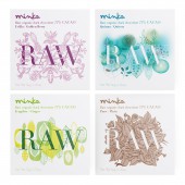
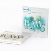
Minka Raw Packaging Desing by tridimage |
Home > |
| CLIENT/STUDIO/BRAND DETAILS | |
 |
NAME: tridimage PROFILE: Tridimage, the leading 3D branding, graphic design and structural packaging agency in Latin America. Its creative headquarters are located in Buenos Aires and has account managers in Mexico, Ecuador and Guatemala. Tridimage's reputation attracts the attention of both established and emerging companies operating in Latin America, the US and Europe. Tridimage has worked in more than 30 countries in the world, carrying out more than 7000 projects. Tridimage designs have won many awards: Pentawards, Vertex Awards, A' Design Awards, Ameristar, Seal of Good Design, POPAI, Estrella del Sur and Pack Andina. |
| AWARD DETAILS | |
 |
Minka Raw Packaging Desing by Tridimage is Runner-up for A' Design Award in Packaging Design Category, 2018 - 2019.· Read the interview with designer tridimage for design Minka Raw here.· Press Members: Login or Register to request an exclusive interview with tridimage. · Click here to register inorder to view the profile and other works by tridimage. |
| SOCIAL |
| + Add to Likes / Favorites | Send to My Email | Comment | Testimonials |


