DESIGN NAME:
Business Works Coaching Logo Design
PRIMARY FUNCTION:
Logo Design and Branding
INSPIRATION:
Coaching for Business and self development has always been a passion to the client. The revamp from the previous brand to a new brandname Business Works, had to communicate a sense of being at the top, being aggressively successful in both strategic thinking as well as a solutions provider when it comes to scaling a business with a proven business system. The entire feel had to feel very strong and trustworthy, and being a leader of the pack.
UNIQUE PROPERTIES / PROJECT DESCRIPTION:
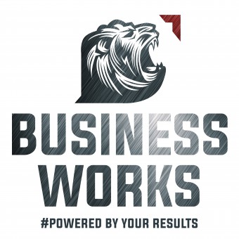
The hardest part of the logo was to illustrate a lion looking upwards and roaring towards the sun. And every detail had to be carefully crafted. To show the upward and forward thinking, a platinum texture had to be used. And it had to point upwards in a 45 degree angle to portray an upward trend in business success. To make the entire logo more interactive, different textures and imagery can be used to feature a different story.
OPERATION / FLOW / INTERACTION:
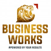
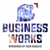
The interactive and the changeable form in the logotype can be adopted in various textures, imagery and colour. Gold, platinum textures can be used to portray any level of courses, the cityscape imaging can be used when going global. The solid colours can be always contemporary.
PROJECT DURATION AND LOCATION:
The job was done in Melbourne.
FITS BEST INTO CATEGORY:
Graphics, Illustration and Visual Communication Design
|
PRODUCTION / REALIZATION TECHNOLOGY:
Many possibilities were explored for the production of the entire stationery series, from hot stamping the gold to holographic print could be the printing techniques when it came to printing the stationeries. The logo could also be used in apparels, from tees to lanyards during any courses that were offered.
SPECIFICATIONS / TECHNICAL PROPERTIES:
-
TAGS:
Logo Design, Branding, Graphic Design
RESEARCH ABSTRACT:
To draw a lion that appears to be on the top of the horizon, and roaring with success wasn't an easy task. The images of lions had to be researched, consolidated and illustrated. Book research of lion behaviour, patterns and its body gesture had to be looked into in detail.
CHALLENGE:
The hardest challenge was how to depict coaching as a logotype. It had to be carry authority, contemporary and creatively wild in execution. Many sketches and ideas were drawn, like climbing up the ladder, the right choice but it wasn't working. The entire logo needs a strong character. Something like a beast. And the idea came to mind. A lion. A leader of the pack. But having the icon of the lion was too weak. It did not resonate. If the lion was to be used, it had to be doing more. The hardest part of the logo was to illustrate it looking upwards and roaring towards the sun. And every detail had to be carefully crafted. To show the upward and forward thinking, a platinum texture had to be used. And it had to point upwards in a 45 degree angle to portray an upward trend in business success. To make the entire logo more interactive, different textures and imagery can be used to feature a different story.
ADDED DATE:
2018-09-26 14:15:42
TEAM MEMBERS (1) :
IMAGE CREDITS:
Lawrens Tan, 2018.
|


