Achieving Alignment Residential Apartment by Regina Kwok |
Home > |
 |
|
||||
| DESIGN DETAILS | |||||
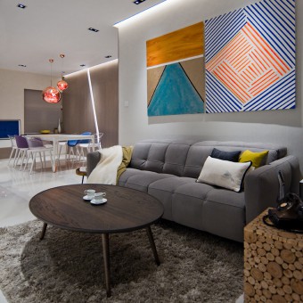
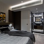
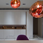
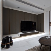
| DESIGN NAME: Achieving Alignment PRIMARY FUNCTION: Residential Apartment INSPIRATION: The owner's brief is very specific and tactical because the family has been living in the apartment for fifteen years. Although the apartment is not small for dense Hong Kong, the owners always felt lacking in space for storage, for their three adult children when they visit, and for their four dogs. The Z shaped orientation of the living and dining rooms had always made the owner feel the main areas of activities were disjointed. Thus, realigning lines, axes, and elevations to better use the available space is the main task at hand. UNIQUE PROPERTIES / PROJECT DESCRIPTION: The TV is offset from the living room walls to leave room for them to become doors to storage closets. The TV pedestal on a raised platform is a playground for the dogs, with its elevation changes. The entertainment centre's new location means there is now a clear line of vision from the dining room - a focal point for the whole living area. A wall is moved to enlarge the master bedroom, creating another focal point anchored by a larger bed and flanked by a walk-in closet and ensuite bathroom. OPERATION / FLOW / INTERACTION: Throughout the apartment, long, uninterrupted lines adorn the surfaces of walls and partitions, e.g. a ridged wooden feature wall, a slanted, recessed light box in the dining room wall and artwork that emphasises the line, enhancing the flow of energy through the newly generated perpendicular axes. PROJECT DURATION AND LOCATION: The project was completed in April 2017 in Hong Kong. FITS BEST INTO CATEGORY: Interior Space and Exhibition Design |
PRODUCTION / REALIZATION TECHNOLOGY: Because of the non-rectangular layout of many spaces in this apartment, a number of corridors exists. To avoid a sense of enclosed compression, we put in different reflective surfaces, such as mirrors and glass partitioning. Other features such as revealed ceiling trims ensure a lighter spatial quality. SPECIFICATIONS / TECHNICAL PROPERTIES: 134 sq. m. TAGS: Interior design, residential, apartment, Hong Kong, Alignment, Focal Point, Cavendish Heights, Artwill RESEARCH ABSTRACT: Although we always have detailed discussions with clients about design goals, because this owner had already been living in the apartment, we created weekly diaries (text & video) of their lifestyle and habits for a total of two months before design and after move-in. We studied their interactions with each room, as "fly on the wall", as well as asked them to record their usage. This research allowed us to be accurate from the get-go, from which rooms to see as focal points to details such as what height to design counters. CHALLENGE: As the owner had been living in the apartment already, there was a much stricter requirement on project time. Furthermore, a lot of 3D modeling and visualization had to be used with the owner to get them onboard with spatial changes - they were very used to the space and could easily pick out issues with new proposals. This continued even after the completion of the project - moving back into the redesigned space took more getting used to for the owner. Knowing this, we advised them to move in with just the most essential pieces of furniture, and then continued to work with them in a highly interactive fashion on furnishing the rest of the space. This approach demonstrates devotion to our user-centric design principal. ADDED DATE: 2017-10-06 10:52:19 TEAM MEMBERS (1) : Regina Kwok IMAGE CREDITS: Regina Kwok |
||||
| Visit the following page to learn more: https://www.artwill.com.hk | |||||
| AWARD DETAILS | |
 |
Achieving Alignment Residential Apartment by Regina Kwok is Runner-up for A' Design Award in Interior Space and Exhibition Design Category, 2017 - 2018.· Read the interview with designer Regina Kwok for design Achieving Alignment here.· Press Members: Login or Register to request an exclusive interview with Regina Kwok . · Click here to register inorder to view the profile and other works by Regina Kwok . |
| SOCIAL |
| + Add to Likes / Favorites | Send to My Email | Comment | Testimonials |


