Bernice Recto Jewelry Brand Identity and Logo by Bernice Recto |
Home > |
 |
|
||||
| DESIGN DETAILS | |||||
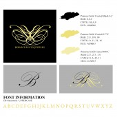
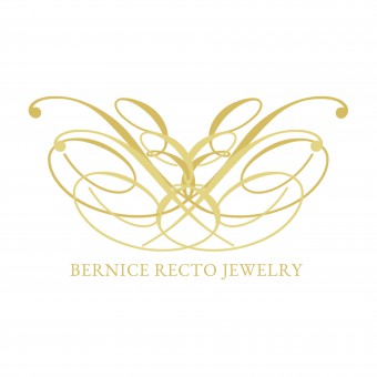
| DESIGN NAME: Bernice Recto Jewelry PRIMARY FUNCTION: Brand Identity and Logo INSPIRATION: The inspiration of the logo was drawn from monograms primarily used to personalize belongings. Gold is the color preferred for the logo as it depicts timelessness, the curves represent femininity and the intertwined lines symbolize integration. These elements are formed by four letter B's that represent Beauty, Boldness, Brilliance and Bernice and together they form a tiara, a classic accessory worn by women of power to embody confidence. UNIQUE PROPERTIES / PROJECT DESCRIPTION: The logo of Bernice Recto Jewelry is composed of four Bs. This represents Beauty, Boldness, Brilliance and Bernice. OPERATION / FLOW / INTERACTION: The logo acts as the symbol and sole identity of the brand. PROJECT DURATION AND LOCATION: Bernice Recto Jewelry officially launched its online store on April 15, 2016 in Metro Manila, Philippines. FITS BEST INTO CATEGORY: Graphics, Illustration and Visual Communication Design |
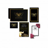
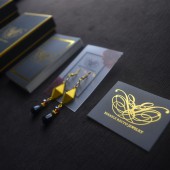
PRODUCTION / REALIZATION TECHNOLOGY: In order to properly represent Bernice Recto Jewelry, the brand needed an iconic identity that would translate the product values into one symbol. intertwined together using the uppercase letter B from the Kunstler script typeface was used to generate this. For the packaging, it was crucial that the icon became the center of it. The textured black paper used to cover the box and the gold lining was proposed and supplied by a local box maker. The same supplier silk screened the icon to the box. For the business cards, it was essential that the material would look as premium as it's box and would match the regal feel of the icon. The paper chosen was in C2S 270 gsm coated in matte with gold foiling for the lamination of the logo. SPECIFICATIONS / TECHNICAL PROPERTIES: Box dimensions: 101.6 mm x 50.8 mm x 152.4 mm Business Card: 53.975 mm x 88.9 mm Earring Holder: 53.975 mm x 88.9 mm Gift Card: 114.3 mm x 44.5 mm (spread); 57.15 mm x 44.5 mm (folded) Press Card: 53.975 mm x 88.9 mm TAGS: Bernice,Recto,Jewelr RESEARCH ABSTRACT: The design for Bernice Recto Jewelry was a concept that was adapted from the usage of monograms. In order to express the uniqueness of the brand, combining the a specific typeface into one symbol helps solidify the identity of the product. Historically, monograms are used to identify a person's belongings. Since jewelry is very personal, the idea was a perfect fit to the purpose of the product. CHALLENGE: The hardest part in producing the design was finding the right gold pantone as it sometimes turns out more yellow or more green when it was proofed or printed. The solution made for the cards was to have it laminated in gold foil instead. ADDED DATE: 2017-02-15 07:28:21 TEAM MEMBERS (1) : Ma. Bernice A. Recto IMAGE CREDITS: Designer/Illustrator/Photographer: Ma. Bernice A. Recto |
||||
| Visit the following page to learn more: https://www.bernicerectojewelry.com | |||||
| AWARD DETAILS | |
 |
Bernice Recto Jewelry Brand Identity and Logo by Bernice Recto is Runner-up for A' Design Award in Graphics, Illustration and Visual Communication Design Category, 2016 - 2017.· Read the interview with designer Bernice Recto for design Bernice Recto Jewelry here.· Press Members: Login or Register to request an exclusive interview with Bernice Recto . · Click here to register inorder to view the profile and other works by Bernice Recto . |
| SOCIAL |
| + Add to Likes / Favorites | Send to My Email | Comment | Testimonials |


