CREAM Aliso Viejo Ice Cream Shop by Hootan Hamedani |
Home > |
 |
|
||||
| DESIGN DETAILS | |||||
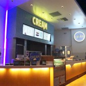
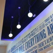
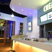
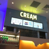
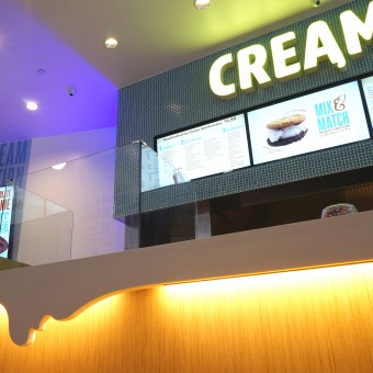
| DESIGN NAME: CREAM Aliso Viejo PRIMARY FUNCTION: Ice Cream Shop INSPIRATION: CREAM, the name of the store, is a short, abbreviated form of: Cookie Rules Everything Around Me. This phrase was an inspirational statement that initiated the design of exterior and interior of CREAM. Instead of looking out for creative ideas we looked closely at what we had in the CREAM ice cream store: warm cookies and cold ice-cream. The color, taste and form of these two items are reflected throughout the store. UNIQUE PROPERTIES / PROJECT DESCRIPTION: CREAM is distinct because it was designed to be simple, charming, and happy space. Simple materials, unique lighting and variety of colors were enhanced for this goal. Blue and yellow lighting that is used in CREAM intensifies the playfulness of the shop. Blue, yellow, white, and brown colors of the materials amplifies happy energies. The fact that every form, light, and color in the store is related to cold ice cream and warm cookies makes the design of CREAM even more distinctive. OPERATION / FLOW / INTERACTION: Customers enter the store. They stand in a line where they can choose their ice cream flavor and cookie. While customers are in the line, they can enjoy the happy atmosphere of CREAM and see the design of the store. PROJECT DURATION AND LOCATION: The Project started in December 2014 and finished in May 2015. It is located in Aliso Viejo, Califonia USA FITS BEST INTO CATEGORY: Interior Space and Exhibition Design |
PRODUCTION / REALIZATION TECHNOLOGY: Simple white surfaces with blue glass tile as a symbol of "CREAM". LED lighting for energy saving and oven exhaust technology to create the smell of cookie for customer's attraction. SPECIFICATIONS / TECHNICAL PROPERTIES: 130 square meter of space with 6 meters weight. Simple materials, shiny surfaces and Stainless Steel. Stained concrete floor and open ceiling. TAGS: CREAM, Ice Cream, Lighting, Sharp, Simple, Modern, Contrast, Flavor, RESEARCH ABSTRACT: The overall ideas and concepts were generated based on the contrast ( in visual aspect), simplicity, attraction, fun environment and cost saving. The process started by studying how simple materials can have unique functions to serve the dynamic design and be attractive and fun for any age ranges. CHALLENGE: CREAM is simple and attractive. Challenges start when there is a limitation in color and finishes (white, blue and stainless steel). Other challenge for this store was the size of store which made a lots of difficulties for maintaining design flow per design criteria. Creating forms, surfaces and lighting were the success point of this project specially for this store which is located in one of the largest shopping mall in southern California. ADDED DATE: 2015-05-24 00:49:49 TEAM MEMBERS (1) : IMAGE CREDITS: Hootan & Associates Design Studio |
||||
| Visit the following page to learn more: http://on.fb.me/1enjGJz | |||||
| AWARD DETAILS | |
 |
Cream Aliso Viejo Ice Cream Shop by Hootan Hamedani is Runner-up for A' Design Award in Interior Space and Exhibition Design Category, 2015 - 2016.· Read the interview with designer Hootan Hamedani for design CREAM Aliso Viejo here.· Press Members: Login or Register to request an exclusive interview with Hootan Hamedani. · Click here to register inorder to view the profile and other works by Hootan Hamedani. |
| SOCIAL |
| + Add to Likes / Favorites | Send to My Email | Comment | Testimonials |


