SATO no Udon Japanese Restaurant by Aiji Inoue |
Home > |
 |
|
||||
| DESIGN DETAILS | |||||
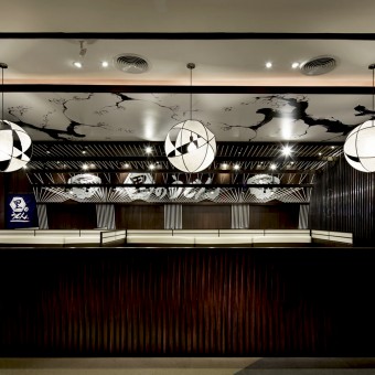
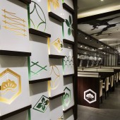
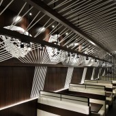
| DESIGN NAME: SATO no Udon PRIMARY FUNCTION: Japanese Restaurant INSPIRATION: One expresses Japanese likeness. For a not Japanese, including Asia, the traditional design of Japan is more intelligible. If a superfluously traditional design is taken in, it will become like an attraction. And then, it will deviate with the present age. Therefore, we paid cautions carefully to the volume of the design which reminds Japanese likeness. UNIQUE PROPERTIES / PROJECT DESCRIPTION: SATO no Udon serves “Udon” (Japanese traditional white noodle) and “Bara don” (bowl of sautéed pork back rib) as main menu. This brand is developed as chain-restaurants, and is the first restaurant to open in an oversea country. Therefore, we were required to create prototypes when looking ahead to other oversea chain-store development. The most important factor in the early stage is to integrate key elements to raise name recognition. Our works range to branding as well, such as redesigning the logo marks. Here are the two design’s touch points we would like to explain. First point is about the crests and Japanese patterned motif designs around the entrance. These designs create big impressions and the pattern elements will be useful to apply to other chain-restaurants. What is more, we put great effort to make these designs look like one identity through the assembly impression. Originally, crests and Japanese patterned designs all have their own meanings. Thus we deliberately combined multiple designs in order to lessen the individual meanings. Second point is the ceiling design of the restaurant which is so dynamic and yet so minimal. The white bars are used to resemble the Udon as if they are woven to create Japanese-style painting. This “Udon” and “Japan” are conceptually expressed to foreigners. These narrative designs will surely become good communication tools between the restaurant and customers. We find it important that restaurants contribute to increase the multidimensional information they transmit to customers. In this way, we hope these original designs will produce fruit and become the characteristics of “SATO no Udon” and expand throughout the world. OPERATION / FLOW / INTERACTION: - PROJECT DURATION AND LOCATION: The project started in October 2013 in Thailand and Japan, and finished in January 2014. It was opened January 10th 2014 in Bangkok, Thailand. FITS BEST INTO CATEGORY: Interior Space and Exhibition Design |
PRODUCTION / REALIZATION TECHNOLOGY: It is basically arranged with color schemes emphasizing “exquisite restaurant” and stressing the designs of easiness for casual usage. We have spent an adequate time for the layout, and planned deliberately for the convenience and dramatic impact, one of which is, the entrance wall. It is that we used the crests and Japanese patterned motif designs. What is more, we put great effort to make these designs look like one identity through the assembly impression. Originally, crests and Japanese patterned designs all have their own meanings. Thus we deliberately combined multiple designs in order to lessen the individual meanings. The crest panel was made by a Acrylic board and putting concealed lighting on behind. And telling the ceiling design, the white bars are used to resemble the Udon as if they are woven to create Japanese-style painting. The white bars we used are 700 or more pieces. This “Udon” and “Japan” are conceptually expressed to foreigners. These narrative designs will surely become good communication tools between the restaurant and customers. SPECIFICATIONS / TECHNICAL PROPERTIES: The white bars of ceiling: diameter of 10 mm The ceiling art: w 7650 mm x D 2000 mm TAGS: Japan, Restaurant, Udon, Crest, Dynamic, Minimal, Narrative, Pattern, Ceiling RESEARCH ABSTRACT: - CHALLENGE: - ADDED DATE: 2014-09-29 06:59:06 TEAM MEMBERS (1) : The ceiling art: Isamu Katsumata/ Illustrator IMAGE CREDITS: All photo credits/ Storu Umetsu, Nacasa&Partners Inc. |
||||
| Visit the following page to learn more: http://www.doylecollection.jp/works/sato |
|||||
| CLIENT/STUDIO/BRAND DETAILS | |
 |
NAME: SATO no Udon PROFILE: - |
| AWARD DETAILS | |
 |
Sato No Udon Japanese Restaurant by Aiji Inoue is Runner-up for A' Design Award in Interior Space and Exhibition Design Category, 2014 - 2015.· Read the interview with designer Aiji Inoue for design SATO no Udon here.· Press Members: Login or Register to request an exclusive interview with Aiji Inoue. · Click here to register inorder to view the profile and other works by Aiji Inoue. |
| SOCIAL |
| + Add to Likes / Favorites | Send to My Email | Comment | Testimonials |


