DESIGN NAME:
Broadway Health Food
PRIMARY FUNCTION:
Supermarket
INSPIRATION:
Functionality, Earthy, Natural, colorful, lively, Drawing attention and customers, comfort, Providing an appropriately designed facility as a dynamic place. The owner had 2 other supermarkets in the same city - the design and methods of merchandising were studied. Other competitors supermarkets were also studied to understand the connection of the design to the health food niche market. I then proceeded to create a design that is new and different while also having a sense of familiarity and comfort.
UNIQUE PROPERTIES / PROJECT DESCRIPTION:
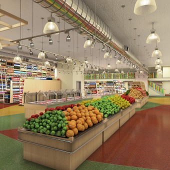
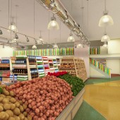
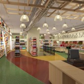
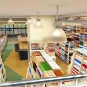
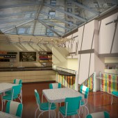
The project was a health food store on two floors plus a dining mezzanine. Included the main store that sold vitamins, brazilian style Buffet, health food, organic products of all types. In the basement was a kosher health food store with kosher prepared foods. Existing commercial property with mezzanine addition with huge skylight covering. Custom designed shelving and store fixtures. Required to design two kitchens - one kosher and one non-kosher. The shelving design makes for shoppers easy viewing of all of the products.
OPERATION / FLOW / INTERACTION:
The Tri color glass set in the railings make a daily event - at certain times of the day, the glass is illuminated by the sun shining through the skylight behind it. The glowing glass is to draw attention to the store of people passing by on the sidewalk outside and create a beautiful event for the customers inside. The shelving were deigned so customers can easily see and access all of the products on the shelves. The shelves also help to create a sense of open-ness since they are further apart at eye level than they are at the ground level.
PROJECT DURATION AND LOCATION:
Designed on fast track delivery with perpetually expanding scope - started in October 2000 and completed in October 2001
|
PRODUCTION / REALIZATION TECHNOLOGY:
Original tin ceiling, Birch Plywood Fixtures, Epoxy Floor, Colored Glass, Custom Ironwork, Paint, Lighting. The owners' design direction was that the store is to have a retro feel to it while also being cutting edge and up to date,modern, use natural materials like wood and stone, the design should reinforce and be appropriate to the sensibilities of health food and organic food.
SPECIFICATIONS / TECHNICAL PROPERTIES:
Approximately 520 sqm with generally 15m X 35m "T" shaped space per floor X 2 floors. The lower floor is primarily storage and food preparation with a smaller Kosher organic and health food market.
TAGS:
Health food, super market, buffet, vitamins, organic food
RESEARCH ABSTRACT:
The owner had 2 stores in NYC already, one in Soho and the other at Union Square. This was to be a new location on the Upper West Side of NYC. The owners product lines were reviewed and owner's program for this store explored. We looked at other similar store types and what they had to offer, the quality of the shopping experience, and the target customer and developed a design that would catch their attention.
CHALLENGE:
Research the competitors in the market. The owner requested a modern interpretation of a retro design that also had a "natural" feel to it.
ADDED DATE:
2013-06-28 08:49:23
TEAM MEMBERS (1) :
IMAGE CREDITS:
Mario J Lotti, 2013.
|
