DESIGN NAME:
Bv
PRIMARY FUNCTION:
Interior
INSPIRATION:
I take delight in comfortable life and enjoy when my clients agree with my word of comfort. This inspires me to create more interesting designs. This project is of small area. I was interested in creation of a design comparable with a Premium car. I like Bugatti Vyeron because when we get into a comfortable car having an elaborated design, all the details adjusted and an air-conditioner, we derive great satisfaction at life and this promotes us to go forward and make progress. The same is my interior – it will never make you stop.
UNIQUE PROPERTIES / PROJECT DESCRIPTION:
Unique features and characteristics of “BV” interior:
1.Energy efficiency. LED strip lights save 80% of energy consumption. As for Daikin Emura air-conditioners, these fall into the category of highest energy efficiency.
2.Ecological compatibility. The tabletop in the guest WC, mosaic on the walls, window stools, parquet strips, wallpapers, 3D-panels are made of MDF, all furniture made of MDF, leather, textile, JAGA KNOCKONWOOD heaters – all this is made of natural materials.
3.Functionality:
•“Infinite Line” lamp economizes space. It releases the room from bulky lusters pertaining height of the room and doesn’t reduce rooms’ dimensions;
•Lights are controlled by using soft-touch control console;
•LED strip lights make it possible to experiment with illumination in the rooms;
•Conduits are very functional with the lamps attached to them;
•Elbows of the sofa and armchair in the living room are detachable to create a long sofa having enough room for many people;
•The sofa in the kitchen has a low back to avoid shutting beautiful view from the window;
•The plinth in the kitchen is in one plane with vertical lamp and in harmony with colors of household appliances;
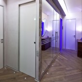
•Thickness of separation walls and up-to-date switches design enabled us to place the switches on the edge of the apertures using the switches of last GIRA collection – E 22, which are located in the surface of the wall. This location makes them invisible and provides accessibility.
•Metal pipe in the quest WC supports bathroom accessories and acts as a towel hanger. Attachment devices for the accessories were separately designed by me.
4.Design ideas. Methods.
• “Infinite Line” lamp was made owing to the supporting pylon existing inside the apartment. I decided not to overload the ceiling space by the lusters but play on the outstanding supporting pylons by this light. As a result – there is much free space both in height and width of the rooms, space dimensions retained;
•The lamps help create the mood and produce any effect you want;
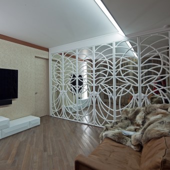
•A vivid snow-white wardrobe with mirror doors in the living room enlarged the space;
•Designer’s panel pictures and apron with a 3D effect made the interior deeper;
•3D panels made of MDF in the hall and partially in the living room and doors with a 3D effect make the rooms more clear and laconic;
•Orange strip of MDF in the living room reflected in the mirror wardrobe makes the interior complete;
•Laconic “Infinite Line” lamps make the interior more dynamic reflecting in the mirrors and in the window at night;
•Parquet strips are laid in different directions intentionally. It connects the hall with the living room by its flowing pattern;
•Part of the ceiling and walls in the kitchen and in the hall are painted grey and covered with silver-sparkling varnish. Accentuation of the walls, ceiling and tabletop with grey color makes the room more rhythmic;
•Glass shelves in the living room are illuminated by mottled LED strip light. Light may have any color you wish;
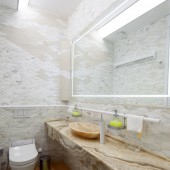
•Wall in the guest WC is entirely an original work of the author. Combination of marble mosaic and limestone produces an effect of cliff. Limestone mosaic is made to order. Illumination inside the vertical columns on the left and on the right of the mirror produces an effect of fire in a cave;
•TV stand in the living room is transportable. It may be placed as you wish as well as used as a coffee table;
•Leather frame in the hall is made of natural leather with a chameleon effect and silver stitch;
•General color of the apartment is light. Light color extends the room.
OPERATION / FLOW / INTERACTION:
“Line” lamps were used to lighten all the rooms. These lamps were designed by me. They emphasize publicity of the rooms in this apartment. They are easy in assembling and energy-saving.
By means of the lamps I illuminated the rooms as well as marked the areas. I indicated dining space in the kitchen and a lounge in the living room. This is what “Line” lamps were used for. The same lights are applied in the hall and guest WC. All the conduits the “Line” lamp is supported by are not just a decoration. They play a functional role in each room. For example, in the kitchen the conduit serves for air exhaust system and air-conditioner; in the hall the electric wires are laid inside of the conduit; in the living room the volume of the conduit defines the lounge area and provides easy handling of the air-conditioner and in the guest WC ventilation system is built in the conduit.
“Line” lamp was made owing to the supporting pylon existing inside the apartment. I decided not to overload the ceiling space by the lusters but play on the outstanding supporting pylons by this light. As a result – there is much free space both in height and width of the rooms. The main task is completed – space dimensions retained.
The lamps may be turned on and off in separate areas. For example, there are 5 areas in the kitchen and it is possible to turn on all the areas, one of them or several parts and specify color and gradual color change for each area.
I applied this vivid snow-white wardrobe with mirrors in the living room. It resulted in a duplicate interior. Owing to the lamps reflection in the mirror the interior took a dynamic turn.
I also applied a muralist 3D-print in the kitchen. This figure makes the kitchen visually deeper and fascinates with its volumes.
However I found an advantage in this, too. I decided to place all the switches on the edge of the apertures. This became possible owing to E22, the last switches collection of GIRA Company.
All the household appliances are made of matt stainless steel and kitchen plinth and the cupboard repeat this material. The plinth is made to order. I needed a plinth with the same thickness as “Line” vertical lamps have. Finally we have plinth and lamp are in one plane.
I decided not to overload the hall. Some walls and doors are made of MDF 3D panels intentionally. The wood gives coziness and warmth and laconic form of the panels brings freedom. The hall slips into the living room.
In the living room 3D-panels wall combines walnut panels. Lines motif is continued. I intentionally made the mirror wardrobe to reflect the lamps and decorative 3D-panels portal.
The sofa and armchair may be joined together. As the room is rather small, I wanted to make the space mobile.
PROJECT DURATION AND LOCATION:
The work on the project was launched at the beginning of September 2011. I started with planning concept and visualization. This stage was passed in short time and then I agreed this with my client. In February 2012 my client was given keys to the apartment and foremen and I started implement my ideas in life. The apartment is located in a “Weltone Park” new buildings complex on Marshal Zhukov avenue in Moscow. Completion date is December 2012.
FITS BEST INTO CATEGORY:
Office Furniture Design
|
PRODUCTION / REALIZATION TECHNOLOGY:
“BV” interior is a design thoroughly thought over and meets all the requirements of people: ecologic compliance, functionality, actuality, quality, energy efficiency and style.
General area of the apartment amounts to 97 square meters. I used 150 mm thick separating foam concrete blocks for acoustic absorption. The ceiling is also isolated by a 5 cm thick layer of cellulose wool and 2 layers of plasterboard. The conducted works on sound absorption made me think about visual expanding of the space.
There are many supporting pylons in the apartment that needed decoration. I invented light that visually hided the outstanding supporting elements and set the room free of bulky lamps. My lamp is very compact and locates only where it is functionally motivated. Also it carries a design idea.
3D effect in the kitchen, 3D-panels in the hall and in the living room, mirrors in the living room, hall and kitchen – all these features expands the space and the light colors of the finish materials combined with dark reflecting surfaces make the room broader and more interesting.
SPECIFICATIONS / TECHNICAL PROPERTIES:
General area of the apartment amounts to 97 square meters. I used 150 mm thick separating foam concrete blocks for acoustic absorption.
TAGS:
“BV” interior, Julia Subbotina interior, BV.
RESEARCH ABSTRACT:
-
CHALLENGE:
During the project execution there were difficulties with production terms and prices. I had to engage other cities to make it cheaper than in Moscow or to employ 3 companies at once for furniture production, for example, for production of the stainless steel cupboard in the kitchen, to make it cheaper. I spent much time and energy on searches and travelling, but it didn’t stop the execution process as it was managed by qualified foremen who always were keeping in touch with me.
ADDED DATE:
2013-02-25 23:42:32
TEAM MEMBERS (1) :
IMAGE CREDITS:
Julia Subbotina, 2012.
|


