DESIGN NAME:
Axial Symphony
PRIMARY FUNCTION:
Residence of a Single Lady
INSPIRATION:
Logic seems to be residing amongst our subconscious whether we like it or not. In here, the role of a designer is merely to epitomize our need in a living environment. Any creators of space were well aware of the importance of symmetry in design. As a basic principle of aesthetic judgment, symmetry has become the design fundamental of many architectural masterpieces. Indeed, property of remaining invariant under certain changes (as of orientation in space, of the sign of the electric charge and of parity) is the essence of a calm interior. On that ground, the ingredient to a good living environment has become clear: we need beauty and comfort to go hand in hand.
UNIQUE PROPERTIES / PROJECT DESCRIPTION:
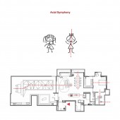
Manipulating axes is the point of departure of this design. Within each functional space, furniture and fixtures are located on an axis that is projected from the most important spatial elements of that zone. The arrangement keeps the inhabitant, physically or visually, always oriented to the centre of the various spaces. In another word, the person is always the epicenter of a space and never to be overpowered by it.
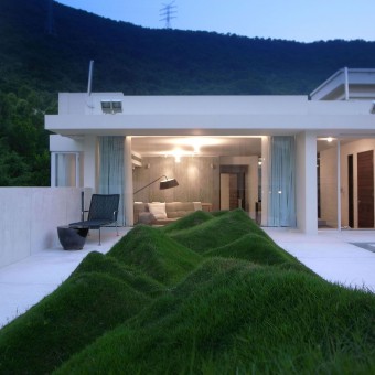
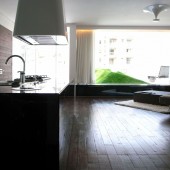
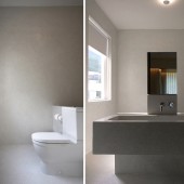
For example, the basin at bathroom is centered to the inhabitants, as the door and the basin are located on the same axis. The water closet is directly facing an aperture, resisting to be stereotypically enclosed. The landscape at the garden is made of a few undulating mounts of small hills swinging from one side of the axis to another. The person sitting on the sofas of the living room, which are centered to the window framing it, views such playfulness of greenery. Each element in space is chosen by its ability to work in harness with the inhabitant, hence evoking beauty in its function.
OPERATION / FLOW / INTERACTION:
-
PROJECT DURATION AND LOCATION:
This office is located in Shenzhen, China, started in September 2009 and finished in April 2010.
FITS BEST INTO CATEGORY:
Interior Space and Exhibition Design
|
PRODUCTION / REALIZATION TECHNOLOGY:
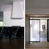
As a result, the inhabitant has become the livelihood of a home. Attention in harmonious details has become paramount to the design, like the nuance of foreground and background, the lightness and weight, smooth and rough, ….. etc. in another word, materials were used basing on their compatibility to spatial function rather than their visual merit. Such as white terrazzo was used for the flooring of the garden to highlight and expose the beauty of the green; on the other hand, recycled boat-building timber was used in the living room for creating a cozy and well-grounded interior. Similarly, when choosing for the material for an open kitchen, darkened glass and black marble was used not only to fulfill its practical performance but also to bring a sense of anchorage into an otherwise visually light and bright interior. A material should appeal to the inhabitant only when its property is fully shown through its function. Ultimately, beauty is just a side product to a comfortable space.
SPECIFICATIONS / TECHNICAL PROPERTIES:
-
TAGS:
comfort, symmetry, axes, sense, harmonious
RESEARCH ABSTRACT:
-
CHALLENGE:
As we endeavor to weave sense into space, a home has stopped being just an environment for living. The design brief was to turn a 150 sq m three-bedroom penthouse apartment into a home for a lady. Instinctively the number of rooms was reduced in exchange for bigger and more personalized en suite. Each piece of furniture and fixings should feature the individual preference of the inhabitant, while holistically they reflect their lifestyle.
ADDED DATE:
2010-10-28 16:01:33
TEAM MEMBERS (5) :
Fanny Leung, Fang Huan Huan , Zhang Xing, Jay Ng and Lansy Dai
IMAGE CREDITS:
Lam Wai Ming, 2010.
|


