DESIGN NAME:
Hangzhou Hisea
PRIMARY FUNCTION:
Brand Design
INSPIRATION:
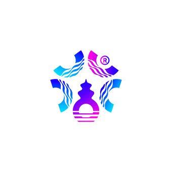
The logo blends traditional Chinese water ripples with modern marine elements for cultural depth and technological aesthetics. Ripples symbolize the flow and vitality of water, conveying Eastern harmony and natural philosophy. The deep sea buoy represents marine exploration and technological innovation. The iconic stone tower in Hangzhou, reimagined in a modern style, balances cultural symbolism with minimalism, and a rising sun shape at its base signifies the vibrant, promising growth of HiSea.
UNIQUE PROPERTIES / PROJECT DESCRIPTION:
Hangzhou HiSea Material Technology Co., Ltd. is an innovative company specializing in developing and producing marine glass with high strength and corrosion resistance. The company is dedicated to advancing deep sea exploration by leveraging professional material technology. The goal of this project is to refresh and upgrade its brand image, effectively and precisely demonstrating its professionalism, innovation, and pioneering spirit in marine exploration.
OPERATION / FLOW / INTERACTION:
The brand logo skillfully combines design elements such as buoys, an iconic stone tower, and water ripples, creating a highly distinctive identity that enables audiences to quickly recognize and remember the brand. The design also incorporates sans serif Chinese and English typefaces, paired with simple, straightforward typesetting to ensure clear and accurate visual communication across both digital and print media. This approach delivers a highly cohesive and unified brand experience.
PROJECT DURATION AND LOCATION:
This project began in Hangzhou, in July 2024 and was completed in October 2024.
FITS BEST INTO CATEGORY:
Graphics, Illustration and Visual Communication Design
|
PRODUCTION / REALIZATION TECHNOLOGY:
The brand color scheme of deep sea blue, tranquil cyan, and coral rose conveys the expertise and innovation of HiSea in marine exploration products and businesses. Sans serif fonts achieve a modern, clear, and readable effect, matching the refined style of a technology brand and adapting to various media. Meticulous font adjustment optimizes presentation across print and digital platforms, and the unique typesetting ensures distinctive, consistent visuals for more impactful communication.
SPECIFICATIONS / TECHNICAL PROPERTIES:
1920px*1080px
TAGS:
Brand identity design, Deep sea exploration technology, Visual branding deployment, Traditional Chinese water ripple pattern, Modern marine elements, Sans serif Chinese and English fonts
RESEARCH ABSTRACT:
This project focuses on revamping the brand image and supporting its development in global marine exploration technology. It blends traditional aesthetics, deep sea exploration technology, and visual branding deployment to create a harmonious, balanced identity for the business. The logo combines traditional Chinese water ripple patterns with modern marine elements, along with a unique color scheme and sans serif fonts to fully convey the professionalism and innovative spirit of HiSea.
CHALLENGE:
The challenge was to harmonize traditional Chinese cultural elements with a high tech marine exploration brand image, ensuring both modernity and an international vision. To this end, the designer explored traditional Chinese auspicious patterns and marine elements, selecting water ripples as the cornerstone. Enriched with the stone tower of iconic Three Pools Mirroring the Moon in Hangzhou, the overall design is culturally rich while highlighting marine exploration via modern design techniques.
ADDED DATE:
2025-02-25 01:40:15
TEAM MEMBERS (1) :
Weiming Tao
IMAGE CREDITS:
Weiming Tao, 2024.
|


