DESIGN NAME:
Hello Beijing
PRIMARY FUNCTION:
Logo
INSPIRATION:
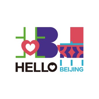
Hello Beijing blends tradition and modernity by combining the Chinese and English characters for Beijing, reflecting the city cultural depth and global identity. The heart design symbolizes warmth and hospitality, while sparkling details represent Beijing vitality across seasons. Drawing inspiration from paper cut and window decoration art, the logo highlights Beijing cultural heritage and modern spirit, showcasing the city's diversity, innovation, and lasting energy.
UNIQUE PROPERTIES / PROJECT DESCRIPTION:
The Hello Beijing logo combines traditional Chinese elements with modern design, representing the city's rich cultural heritage and dynamic global identity. The heart shape symbolizes warmth and hospitality, while sparkling details reflect Beijing vibrant energy throughout the seasons. Inspired by paper cut and window decoration art, the logo celebrates both Beijing cultural legacy and its forward thinking spirit, making it a unique symbol of the city diversity and innovation.
OPERATION / FLOW / INTERACTION:
The Hello Beijing logo is designed for diverse audiences and applications, integrating seamlessly across digital platforms, signage, packaging, and event materials. The heart shaped element creates emotional resonance, while vibrant colors and sparkling details encourage interaction. Its adaptability ensures the logo resonates across cultures, reinforcing Beijing image as a welcoming global city.
PROJECT DURATION AND LOCATION:
Beijing logo project took six months, involving research, design, and refinement.
FITS BEST INTO CATEGORY:
Graphics, Illustration and Visual Communication Design
|
PRODUCTION / REALIZATION TECHNOLOGY:
The logo versatile design supports precise digital rendering and intricate physical techniques for diverse applications.
SPECIFICATIONS / TECHNICAL PROPERTIES:
The logo is versatile, maintaining clarity from small scale applications like business cards (minimum 20mm in height) to large billboards over 2 meters. Its vector-based design ensures scalability and quality across digital and physical media. The color palette follows CMYK and RGB standards for consistent reproduction. Packaging can include embossing, foil stamping, or UV finishes to emphasize key elements. Clear space equal to the heart's height around the logo is recommended to preserve visual integrity.
TAGS:
Beijing, logo design, cultural heritage, modern identity, international metropolis
RESEARCH ABSTRACT:
The research for the Hello Beijing logo focused on Beijing cultural heritage and modern identity. It analyzed traditional art forms such as paper cutting and decorative window patterns while incorporating global branding trends to ensure the design conveys inclusivity, warmth, and contemporary appeal. The resulting logo captures Beijing dynamic energy, historical depth, and welcoming spirit, resonating both locally and internationally.
CHALLENGE:
The creative challenge for the Hello Beijing logo was balancing Beijing’s cultural heritage with its modern, global identity. The team blended traditional elements like paper-cutting with contemporary design to appeal to an international audience. The logo needed to convey the city warmth and vibrancy while being adaptable across mediums and cultures, creating a unique and memorable visual identity rooted in Beijing’s spirit.
ADDED DATE:
2024-11-17 21:16:31
TEAM MEMBERS (1) :
IMAGE CREDITS:
#No : Photographer / Illustrator sun jian
PATENTS/COPYRIGHTS:
Patent: 2024. beijing. copyright sunjian 2024.
|

