DESIGN NAME:
Tonela
PRIMARY FUNCTION:
Branding Project
INSPIRATION:
Creating a brand conveying a happy and healthy lifestyle for everyone, especially seniors and kids. The brand advocates for a lifestyle that embraces natural pursuits, and promotes sustainable well-being. Happiness, joyful and vibrant as the core elements in building up the brand. The name Tonela, it's about sharing joy, creating happy memories, and enjoying life together. Tone is like the mood or vibe, and La sounds in Mandarin is all about happiness and energy.
UNIQUE PROPERTIES / PROJECT DESCRIPTION:
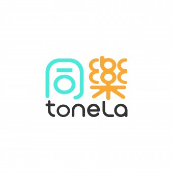
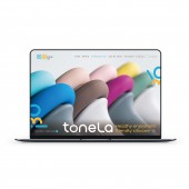
The brand products are all made of silicone, dedicated to promote healthy, sustainable and family fun lifestyle. The brand name toneLa sounds in Mandarin is happiness together, it embodies the spirit of sharing joy together and features vibrant symbols. The brand logo, with its smooth and cute appearance, reflects a friendly image, while the main colors, lively blue and vibrant yellow, respectively represent products for children and seniors, demonstrating care for consumers of different ages.
OPERATION / FLOW / INTERACTION:
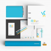
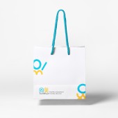
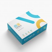
The logo can be applied in various places, including products, packaging, business cards, as well as websites and social media platforms. This helps to enhance the brand's visibility and systemic recognition, allowing more people to learn about the brand.
PROJECT DURATION AND LOCATION:
The branding project started in August 2019 and finalized in July 2020 at Tainan, Taiwan. Having its first debut in Giftionery & Culture Creative, Taipei in April 2021.
FITS BEST INTO CATEGORY:
Graphics, Illustration and Visual Communication Design
|
PRODUCTION / REALIZATION TECHNOLOGY:
The logo is created using Adobe Illustrator and utilizing symbol graphics to enhance consumer impression and memory of the brand. The uniqueness of silicone lies in its versatility. To translate this uniqueness into a visual brand symbol. We employed variations in font structures, extracted usable elements, and recombined them to design a variety of lively and playful symbols. This not only enhances brand flexibility but also increases overall brand memorability.
SPECIFICATIONS / TECHNICAL PROPERTIES:
Minimum height of the logo: 7mm
TAGS:
toneLa, Brand Design, Visual Identity, Logo Design, Visual Communication
RESEARCH ABSTRACT:
The brand wants to help people stay healthy and happy while taking care of the environment. Focusing on seniors and kids and making products that are good for people and the earth. Overall concept is friendly and promote a natural, healthy lifestyle, creating a fun and safety products for seniors and kids. The designs, we care about making people feel good and happy, giving them a great experience. We want families to share happy moments together and bring more people into the fun.
CHALLENGE:
In the design process, the most challenging aspect is naming the brand.
It requires creating a name that sounds pleasant, is easy to pronounce, and conveys a sense of vitality and positivity. The brand caters to both seniors and children, so the name needs to be catchy and memorable.
ADDED DATE:
2024-03-31 09:41:41
TEAM MEMBERS (10) :
Designer: ChungSheng Chen, Designer: SiYu Wu, Designer: TingYuan Lin, Designer: Bowei Jiang, Planner: WanYun Lo, Planner: EnYang Chen, Engineer: HungChi Hu, Tainan University of Technology Product Design Dept, Acdesign Associates International Co.,Ltd and Jin Hui Co.,Ltd
IMAGE CREDITS:
All Images: Acdesign Associate International Co., Ltd.
PATENTS/COPYRIGHTS:
Trademark(2020)JinHui Co., Ltd.
|
