DESIGN NAME:
Crossing Fog
PRIMARY FUNCTION:
Brand Identity
INSPIRATION:
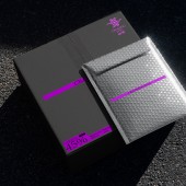
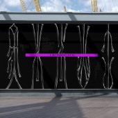
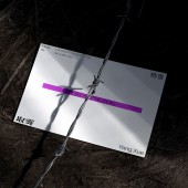
The product packaging features a prominent purple caution line as visual identification. This caution line serves as a warning, symbolizing that every instance of extreme sports begins with crossing the safety threshold marked by the caution line, facing new risks and challenges.
Encouraging users to continually push their limits while emphasizing the need for extreme caution and consideration of unknown risks. This highlights the brand's commitment to safety.
UNIQUE PROPERTIES / PROJECT DESCRIPTION:
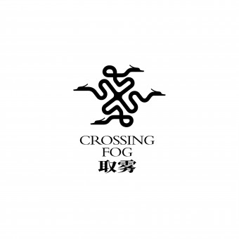
'Crossing Fog' is a sports brand catering to extreme sports enthusiasts, offering protective gear. The brand name suggests users' agility, implying they can navigate through fog effortlessly. The logo is inspired by Eastern mythology, featuring celestial clouds and mythical dragons. Combining these elements, we create a totemic Cloud Dragon emblem infused with Eastern mythological colors.
OPERATION / FLOW / INTERACTION:
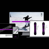
Crossing Fog's distinctiveness is easily identifiable and disseminated during outdoor activities. It aligns with global urban aesthetics, shaping an international, oriental trend, interpreting the symbolism of the Chinese dragon and auspicious clouds. Purple accents enhance visual impact, adaptability, and flexibility, elevating the overall visual effect. They also symbolize "mystery," "limitlessness," and "joy," expressing brand attitude and emotion.
PROJECT DURATION AND LOCATION:
The project commenced its design phase in Shenzhen in April 2023 and was launched on e-commerce platforms in October 2023.
FITS BEST INTO CATEGORY:
Graphics, Illustration and Visual Communication Design
|
PRODUCTION / REALIZATION TECHNOLOGY:
Many materials were used in the creation of the product and package.
SPECIFICATIONS / TECHNICAL PROPERTIES:
The size may vary because there are different types of products.
TAGS:
Logo, Brand, Visual、Sports、Outdoor、Skiing
RESEARCH ABSTRACT:
We aim to establish the brand as an extreme sports brand that embodies a sense of security and Eastern mystique in consumers' minds. To achieve this, we have centered everything from the brand name to the brand totem around Eastern mythology. Our goal is to create a brand that serves as a protective totem imbued with the mysterious power of the East.
CHALLENGE:
Linking Eastern traditional culture with contemporary extreme sports enthusiasts has posed a challenge for us in terms of cultural differences. Ultimately, we incorporated a modern symbol to convey the brand's emphasis on safety.
ADDED DATE:
2024-02-27 10:20:20
TEAM MEMBERS (3) :
Yin Peng, Li Linlin and Menghao Zeng
IMAGE CREDITS:
Chushan Design
|
