DESIGN NAME:
Maotai Flavored Latte
PRIMARY FUNCTION:
Coffee Packaging
INSPIRATION:
Moutai and Luckin Coffee cater to two distinct consumer groups, and to bridge these demographics, a fusion of these top brands in their respective fields is required. Taste-wise, injecting traditional Chinese liquor into a Western latte creates a bold beverage that attracts consumers with its unique flavor, generating much discussion. Visually, combining the classic graphical elements of both brands maintains their individual identity while also presenting a fresh creative twist. The existence of visual identifiers from both brands make Moutai Latte extremely iconic among a merging group of audiences.
UNIQUE PROPERTIES / PROJECT DESCRIPTION:
Moutai represents the pinnacle of luxury in traditional Chinese liquor for its consumers, while Luckin Coffee is the popular coffee brand among the youth. The Soy Sauce Latte combines these two, offering consumers a novel tasting journey. It injects fresh vitality into the traditional industry while expanding the popularity of emerging brands, epitomizing the perfect fusion of traditional cultural elements and modern consumption trends.
OPERATION / FLOW / INTERACTION:
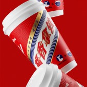
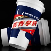
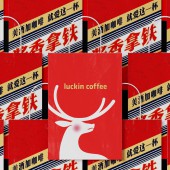
The key to Moutai Flavored Latte' s packaging design is identification and attraction. Merging the visual elements of both brands directly is the most effective design decision. Creating the most effective visuals, We applied the them to cups, cup sleeves, carryout bags, enhancing the visual identification of the brand. The strong and effective visual elements has also stimulated and inspired consumers for secondary recreation and redesign and these redesigns have pushed the campaign to the peak of popularity.
PROJECT DURATION AND LOCATION:
Started in May 2023 and finished in October 2023. The campaign was launched in October 2023.
FITS BEST INTO CATEGORY:
Graphics, Illustration and Visual Communication Design
|
PRODUCTION / REALIZATION TECHNOLOGY:
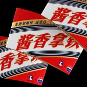
For leading brands like Moutai and Luckin Coffee, the most appropriate visual strategy is "no design". Merging the visual elements of both brands directly is the most effective design decision. The design is simple but strong. Moutai's red and slanted Chinese characters, along with Luckin's blue and deer image, are all reflected in the packaging. It attracts consumers with familiar visual symbols from both brands, while the novel beverage directly stimulates the desire to try new things.
SPECIFICATIONS / TECHNICAL PROPERTIES:
-
TAGS:
Tiger Pan, Lukin Coffee, Beverage Packaging, Campaign, Visual Communication
RESEARCH ABSTRACT:
The Chinese consumer market is highly segmented. To break through consumer limitations for Moutai and Luckin Coffee, the fusion of traditional culture with modern consumption trends is necessary to increase brand value. This also injects new vitality into the beverage industry, reflecting the importance of design sensitivity to culture and the balance between localization and globalization in the context of global markets.
CHALLENGE:
Moutai represents the pinnacle of luxury in traditional Chinese liquor for its consumers, while Luckin Coffee is the popular coffee brand among the youth. Moutai and Luckin Coffee cater to two distinct consumer groups, and to bridge these demographics, a fusion of these top brands in their respective fields is required.
ADDED DATE:
2023-11-14 03:06:26
TEAM MEMBERS (1) :
Tiger Pan, Peng Lei, Chen Yiwen, Machao
IMAGE CREDITS:
Tiger Pan
|


