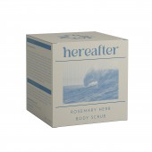
Hereafter Body Care by Mariia Terebenina |
Home > |
 |
|
||||
| DESIGN DETAILS | |||||
| DESIGN NAME: Hereafter PRIMARY FUNCTION: Body Care INSPIRATION: The visual identity of the brand 'Hereafter' UNIQUE PROPERTIES / PROJECT DESCRIPTION: The design for 'Hereafter' OPERATION / FLOW / INTERACTION: - PROJECT DURATION AND LOCATION: - FITS BEST INTO CATEGORY: Packaging Design |
PRODUCTION / REALIZATION TECHNOLOGY: It's a concept design, therefore it was only developed digitally. SPECIFICATIONS / TECHNICAL PROPERTIES: The dimensions cannot be provided since it is a conceptual project. For materials, can be considered eco-friendly options such as biodegradable / recycled plastic and paperboard. TAGS: cosmetic, brand, packaging, sustainable, skincare RESEARCH ABSTRACT: - CHALLENGE: - ADDED DATE: 2023-05-07 16:00:20 TEAM MEMBERS (1) : IMAGE CREDITS: Mariia Terebenina, 2024. |
||||
| Visit the following page to learn more: https://www.behance.net/marieter | |||||
| AWARD DETAILS | |
 |
Hereafter Body Care by Mariia Terebenina is Runner-up for A' Design Award in Packaging Design Category, 2024 - 2025.· Read the interview with designer Mariia Terebenina for design Hereafter here.· Press Members: Login or Register to request an exclusive interview with Mariia Terebenina. · Click here to register inorder to view the profile and other works by Mariia Terebenina. |
| SOCIAL |
| + Add to Likes / Favorites | Send to My Email | Comment | Testimonials |


