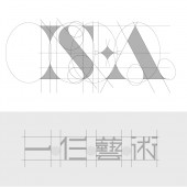
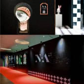
IS·A Gallery Branding Gallery Branding by Mingjun Jiang |
Home > |
| CLIENT/STUDIO/BRAND DETAILS | |
 |
NAME: ISA Gallery PROFILE: An art institution in Shenzhen |
| AWARD DETAILS | |
 |
Is·a Gallery Branding Gallery Branding by Mingjun Jiang is Runner-up for A' Design Award in Graphics, Illustration and Visual Communication Design Category, 2021 - 2022.· Read the interview with designer Mingjun Jiang for design IS·A Gallery Branding here.· Press Members: Login or Register to request an exclusive interview with Mingjun Jiang. · Click here to register inorder to view the profile and other works by Mingjun Jiang. |
| SOCIAL |
| + Add to Likes / Favorites | Send to My Email | Comment | Testimonials |


