DESIGN NAME: CYT DESIGN CORPORATE IDENTITY
PRIMARY FUNCTION: Brand Vision
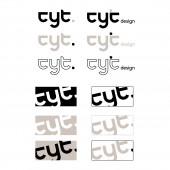
INSPIRATION: As an extension of modern Japanese aesthetic concept, the Wabi-Sabi style appreciates the beauty of imperfection, simplicity and quietness with extremely inclusive eyes. Inspired by this style, designers have created commonalities in the evolution of brand initials C, Y and T, extending from the consistency of radian and strokes to the cyclic evolution of the whole visual image.
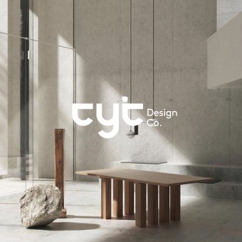
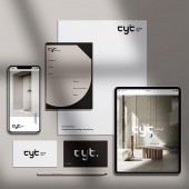
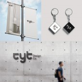
UNIQUE PROPERTIES / PROJECT DESCRIPTION: This is a brand visual image designed for CYT Design. It is designed according to the Wabi-Sabi style that matches the brand image, and it incorporates the unique gray color as the main tone, and the original ecological environment concept, which is not only the brand's tribute to the cutting-edge design style, but also the embodiment of its insistence on using only natural raw materials.
OPERATION / FLOW / INTERACTION: In addition, designers have designed different color matching methods and widely used various related formats for this visual image, which can cover different scenarios.
PROJECT DURATION AND LOCATION: The program was initiated in January 2021 in Guangzhou, Guangdong Province and was completed in June 2021 in Guangzhou, Guangdong Province.
FITS BEST INTO CATEGORY: Graphics, Illustration and Visual Communication Design
|
PRODUCTION / REALIZATION TECHNOLOGY: Based on the initials C, Y and T of the brand name, this visual image forms an inclusive pattern through the mutual evolution of the three letters. At the same time, it also integrates the combination pattern of these three letters as a part of the visual image, which makes the abstract artistic style intuitively conveyed through the visual effect, and also endows the logo with stronger conceptualization and higher recognition.
SPECIFICATIONS / TECHNICAL PROPERTIES: -
TAGS: Brand image design, minimalist and Wabi-Sabi style, geometric modeling, environmental concept, the visual image of the soft outfit design brand
RESEARCH ABSTRACT: After the preliminary study by the design team, it is found that the visual images of traditional design companies generally only have visual patterns, which are out of step with the development trend of modern aesthetic trends, and lack intrinsic meaning and tonality of brands. This leads to the high repetition rate of the visual images of all the brands, and it would be difficult for users to associate the visual images with the company business.
CHALLENGE: The main challenge facing the design work of this visual image is how to find the commonness between the brand initials and integrate them into the visual image in a figurative way. On the basis of keeping the recognition of letters, the designer realizes this purpose by combining the three letters and reducing strokes. The unique shape breaking the convention can be regarded as blank space, and it also increases the recognition and differentiation of visual images.
ADDED DATE: 2022-03-29 07:19:12
TEAM MEMBERS (1) : Designer: HUI MEI YE
IMAGE CREDITS: Huimei Ye, 2021.
|