DESIGN NAME:
Joy
PRIMARY FUNCTION:
App
INSPIRATION:
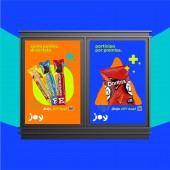
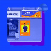
To communicate this revolutionary approach, Joy needed a visual identity capable of conveying clearly, many things at once: happiness, rewards, snacks, content and connectivity. To achieve this, a dynamic and expressive visual system was created. Based on lively pictograms, bright digital colors, simple typeface, a charismatic photographic style and a unique smiley logo, Joy’s visual identity was planned to give a fresh look to the brand and a flexible way of implementing it.
UNIQUE PROPERTIES / PROJECT DESCRIPTION:
Joy is a personalized content platform, where consumers can enter a totally new way of experimenting with brands. In Joy they can find customized activities, prizes and special content relevant to their likes and interests. Whether they choose a product that is sweet or salty; consumers will receive nothing but tailored experiences all year long. It doesn’t matter if they prefer music instead of football, Joy app has them covered.
OPERATION / FLOW / INTERACTION:
-
PROJECT DURATION AND LOCATION:
-
|
PRODUCTION / REALIZATION TECHNOLOGY:
-
SPECIFICATIONS / TECHNICAL PROPERTIES:
-
TAGS:
-
RESEARCH ABSTRACT:
-
CHALLENGE:
-
ADDED DATE:
2022-02-25 21:23:41
TEAM MEMBERS (1) :
IMAGE CREDITS:
PepsiCo Design and Innovation PepsiCo Design, 2021.
|


