DESIGN NAME:
Turn & Look
PRIMARY FUNCTION:
Residential House
INSPIRATION:
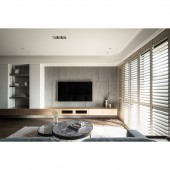
Turn & Look , organized for a retired couple who enjoys travelling. The overall design is a smart interplay of modern American, Scandinavian and minimalist styles.
UNIQUE PROPERTIES / PROJECT DESCRIPTION:
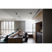
By combining the living room and the study to enlarge the common area, the otherwise darker hallway is shortened. The entire space, be it the ceilings, desk corners and façade are specifically chamfered and curved. In so doing, not only is the safety of the space enhanced, but the design is made visually soft and warm as well as user-friendly.
OPERATION / FLOW / INTERACTION:
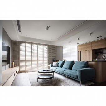
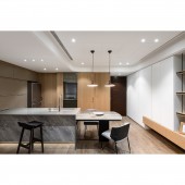
Light gleams through Venetian doors at the entrance. To allow for more flexibility in the use of the living room, an island with storage is installed in place of a dining table, and two delicate chandeliers are outfitted to suggest division of sections. The guest bathroom and the kitchen adjacent to it are located near the entrance and are decorated with symmetrical mirrored surfaces and wood veneers.
PROJECT DURATION AND LOCATION:
The project is in Taoyuan, Taiwan.
FITS BEST INTO CATEGORY:
Interior Space and Exhibition Design
|
PRODUCTION / REALIZATION TECHNOLOGY:
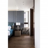
A walk-in closet is specifically planned in the master bedroom, with its wall adjacent to the bedroom covered with thin stone bricks, which, together with chamfers and light belts, makes for low-profile luxury. The ceiling is inlaid with titanium, while slightly metallic tone decorates the headboard. This combination of different decorative materials creates a sense of grandeur. The headboard upholstery conceals large storage room for practical needs. The incorporation of calming gray, blue and green makes the room appear serene and stable. A small, compact vanity room is laid out using remaining space along the wall. Prominent veins on the mirror cabinets are suggestive of a tranquil, laid-back life.
SPECIFICATIONS / TECHNICAL PROPERTIES:
-
TAGS:
ZhuChuan Interior Design, Yu Kun Shih, Residential House, Interior Design, Modern American, Scandinavian, Minimalist styles
RESEARCH ABSTRACT:
The curve element is consistent on the ceilings, floors and walls of all the sections in the entire room. Large amounts of wooden texture, paired with deliberate void of white, allows for a feel of warmth and stability, while different materials work well with fair proportion of lines. Thus, getting home is just the beginning of an intimate sense of belonging and enjoyment.
CHALLENGE:
Neat storage stretches from the entrance to the TV wall, with the neutral tone of white softening the relatively cold one of gray in the dining-kitchen section. As opposed to this simple American style, the study enjoys an open plan with lowered floor that serves to make the room look bigger, with warm-toned door panels hiding large storage from sight. Turquois sofas and the wood tone present a fun contrast. Indirect lighting and recessed fixtures are installed in the entire room to retain its original height. By lowering the wooden floor, the coldness of the minimalist style is reduced, adding security and warmth to the room.
ADDED DATE:
2022-02-25 09:49:35
TEAM MEMBERS (1) :
IMAGE CREDITS:
Yu Kun Shih, 2021.
|


