DESIGN NAME:
Light and brightness
PRIMARY FUNCTION:
Residence
INSPIRATION:
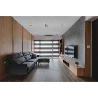
This project is a renovation of an old house, and the design team has made the change according to the client's needs. The original style of the space was traditional, with lines and panels. After renovation, all the old elements were removed, and the client's favorite wood element is added to the space. Besides, the design team has also seen the drawbacks of space and re-planned the layout to improve the lighting. Given that the client's height is close to 190cm, the ceiling was remeasured to give the client the most comfortable space design, both visually and mentally.
UNIQUE PROPERTIES / PROJECT DESCRIPTION:
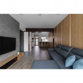
Lighting and ventilation have always been the two most important factors in interior design. The original position of the kitchen is opposite to that of the guest bedroom, but this causes the light to be shone in one direction and the air cannot circulate from side to side. After the alignment of the layout, the public area can be linked into a line to improve the lighting. The design team also remodeled all the ceilings and ordered natural wood veneer to increase the height from the original 2.4m to 2.85m, allowing the client who is 190cm in height to walk around freely.
OPERATION / FLOW / INTERACTION:
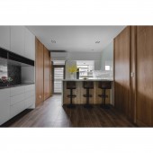
The height of the standard wood veneer was originally only 2.4m, which seemed cramped for a person of 190cm in height. In addition, the lack of lighting made the space slightly dark, so the design team modified the ceiling and layout and solved the homeowner living inconvenience. The door of the master bedroom faces the TV wall, which will cause visual errors when moving from the private area to the public area. Therefore, the design team used suspended cabinets to balance the position of the TV and added a center island to enhance convenience.
PROJECT DURATION AND LOCATION:
The project finished in December 2021 in Taiwan.
FITS BEST INTO CATEGORY:
Interior Space and Exhibition Design
|
PRODUCTION / REALIZATION TECHNOLOGY:
This project adopts wood elements and some stone, and the ratio is 7:3. For example, wood grain tiles are used for flooring, oak is used for walls that break the public and private areas, and artificial stone is used for kitchen cabinets and bathrooms. Finally, the design team also used paint, tile, fabrics, mosaic, and other materials to create a warm and refreshing space.
SPECIFICATIONS / TECHNICAL PROPERTIES:
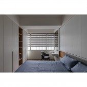
This project is on the fifth floor of an old building with 109 square meters of space with 3 bedrooms, and both master and second bedrooms have fully functional closets and three-piece bathrooms. The reason for the lack of lighting was that there was no consistency in the public area so the light could not reach every corner. The design team reshaped the layout and used the center island and moru glass to introduce natural light.
TAGS:
Modern, wood, lighting, elevated, oak.
RESEARCH ABSTRACT:
The feature of (Light and brightness) is that natural light can be drawn into the room, and the original small kitchen and living room can be combined and connected to become open spaces. In the private area, each room and bathroom is lighted, which is a rare comfort. The project combines the ingenuity of the design team, which integrated color flashing and balancing, consistent configuration of the public area, solving Feng-Shui problems, and adding the client's favorite wood elements.
CHALLENGE:
In addition to the client height and space allocation, the client doesn't like the standardized design so the ingenuity design can be found everywhere in the space. For example, the solid wood strips on the back wall of the sofa have special processing, the color of the wooden walls has a color flash design, and the TV cabinet has a hollow design. With neutral colors and wood elements as the theme, the design team overcomes the standard traditional style.
ADDED DATE:
2022-02-25 06:04:11
TEAM MEMBERS (1) :
Cheng-Hsien Wu
IMAGE CREDITS:
Home Chen Interior Design
|


