DESIGN NAME:
TLB Digital
PRIMARY FUNCTION:
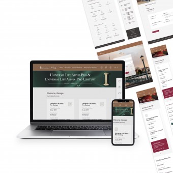
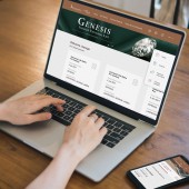
Customer Insurance Portal
INSPIRATION:
Transamerica Life Bermuda has established itself as a leading High Net Worth life insurer with over 100 years of history. Taking pride in their past and thinking for the future, the team was inspired to marry the two to build a digital experience that is established, classy, reliable, and assuring while still evoking an entrepreneurial spirit.
UNIQUE PROPERTIES / PROJECT DESCRIPTION:
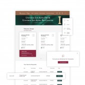
The main objective of the portal is to provide customers with more control over their policies as well as to facilitate even better and efficient communication. Focusing on ease, the team developed intuitive forms to guide customers through the use of layout, cards and action-led buttons. This is complemented with a quick access sidebar for customers to navigate directly to frequently used features.
OPERATION / FLOW / INTERACTION:
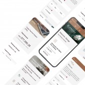
Accessibility and mobility is considered while designing the portal. The portal was designed to allow the High Net Worth customers to manage transactions on the go. From creating an account to retrieving their annual statements, customers can easily navigate the clean and elegant interface designed to highlight the information that matters the most. Throughout the whole journey of the customer, simplified verification processes were seamlessly added to ensure that customers feel secure but never frustrated.
PROJECT DURATION AND LOCATION:
The portal was designed in Singapore across from June 2021 to November 2021.
|
PRODUCTION / REALIZATION TECHNOLOGY:
The user interface of this portal was designed in Figma.
SPECIFICATIONS / TECHNICAL PROPERTIES:
Responsive mobile and desktop UI/UX design for a portal which provides users with easy access to information and transactions for insurance policies.
TAGS:
User Experience, User Interface Design, Design System, Portal, Responsive
RESEARCH ABSTRACT:
The portal was a result of understanding how the customers, culture, and mindset of the world today intersects with the identity as well as direction of TLB. Working with cross-functional teams from the client, the team explored how TLB is able to connect with their future audience while showcasing their well-established classy visual identity.
CHALLENGE:
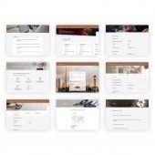
The main challenge was to consider how a complex portal can be easily scalable for future addition of new features or forms. Beginning from the overall visual identity; signature brand colours from TLB were incorporated to build trust and brand recognition across all pages. The team went on to create 32 unique templates and 35 resuable components to cater for the sustainability of the portal in the long run.
ADDED DATE:
2022-02-24 06:44:23
TEAM MEMBERS (10) :
Project Sponsor: Sebastian Troen, Dev. Oversight: Calvin Ye, PMO & UX Analyst: Leon Hatnam, Creative Director: Emmanuelle Hu Ying, Business Analyst: Catherine Lau, CX Strategist: Diksha, Front-End Dev. Lead: Jun Shen, Front-End Developer: Wei Zheng and Qingyuan Lu, Back-End Developer: Xin Ge and Tester: Jihong Sun
IMAGE CREDITS:
frog Singapore, 2022
|
