Dialog Box Interior Design by CHEN, KUAN-CHIAO |
Home > |
 |
|
||||
| DESIGN DETAILS | |||||
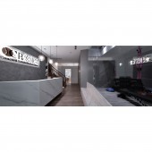
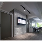
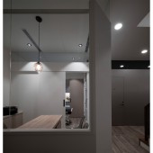
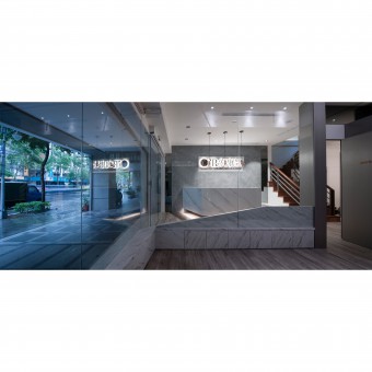
| DESIGN NAME: Dialog Box PRIMARY FUNCTION: Interior Design INSPIRATION: The lintel storefront signboard was framed by a white background and embedded with exclusive CI totem and optical character to bring a refreshing and pleasant visual impression. It also vaguely reveals the elegant, exquisite, and light luxury style to be reflected insides the clinic. The designer put a large floor-to-ceiling window at the entrance of the first floor and framed the window with a deliberate thickened white stone. At a glance, it looks like a transparent glass box. UNIQUE PROPERTIES / PROJECT DESCRIPTION: This case is in the roadside commercial office building, and it is the planning for the physical therapy and rehabilitation clinic covering the first and second floors. The current site was formerly a furniture store. After a detailed site survey, the designer removed all the original wooden compartments, but kept some modeling walls on the second floor. After the transformation of this floor, it became a light classical style that helps patients relieve and relax. OPERATION / FLOW / INTERACTION: The first floor has excellent height conditions. The partition walls mainly retained the partial penetration of the upper edge so that the line of sight can be extended through the elevation angle, amplifying the space experience and taking into account the necessary privacy of the clinic. The second floor deliberately added aesthetic light classical elements to soothe the patients' moods. At the same time, it also echoed the classical modeling wall preserved in the original layout. PROJECT DURATION AND LOCATION: The project finished in Jun. 2020 in New Taipei City, Taiwan. FITS BEST INTO CATEGORY: Interior Space and Exhibition Design |
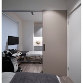
PRODUCTION / REALIZATION TECHNOLOGY: The material selection of the whole case is very characteristic. The main walls of the waiting area, and the physical therapy area is gray with a metal hairline finish, which complements each other with gray mirrors. It was also vividly compared with the gray and white cornerstone. The clinic employed the leather cutting sheet with the cornerstone, which shows elegant and charming boutique charm through different material color jumping tension and skillful proportion. Besides building the brick wall compartment in the X-ray room on the second floor, there's a lead plate place on the inner side to prevent radiation penetration. SPECIFICATIONS / TECHNICAL PROPERTIES: This space is 188.5 square meters. TAGS: Interior Design, Clinic, Commercial space, Office building RESEARCH ABSTRACT: Base of the overall space on the first floor with a low-key grayscale and simple modern sense. With the warmth of PVC wooden design floor, people can moderately relieve their mood. The main body of the counter of thin marble bricks, which subtly echoes with the trowel texture made of cement texture special coating on the background wall. CHALLENGE: Such professional clinics need to use lots of equipment during treatment, so recalculating the capacitance is significant. The specific area water, pipelines, and tank configurations are also the focus of planning. ADDED DATE: 2021-09-23 11:03:40 TEAM MEMBERS (1) : CHEN, KUAN-CHIAO IMAGE CREDITS: Photographer : LIN, FU-MING |
||||
| Visit the following page to learn more: https://www.facebook.com/reichenlich/ | |||||
| AWARD DETAILS | |
 |
Dialog Box Interior Design by Chen, Kuan-chiao is Runner-up for A' Design Award in Interior Space and Exhibition Design Category, 2021 - 2022.· Read the interview with designer CHEN, KUAN-CHIAO for design Dialog Box here.· Press Members: Login or Register to request an exclusive interview with CHEN, KUAN-CHIAO. · Click here to register inorder to view the profile and other works by CHEN, KUAN-CHIAO. |
| SOCIAL |
| + Add to Likes / Favorites | Send to My Email | Comment | Testimonials |


