DESIGN NAME:
Home of Morden
PRIMARY FUNCTION:
Residential
INSPIRATION:
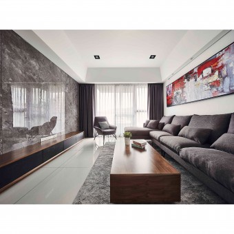
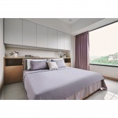
The designer took advantage of the natural lighting, installed expansive windows to close the natural sceneries within the indoors. Clean and straightforward modern linear also supported the space with eclectic rectangular geometries that connect in between rooms. The design delivered a modern and precise style through the black and white color tones that build up color contrast. The designer even performed color flashing to smartly bring in a visual sense of lively, giving the owner wonderful imaginations towards future life.
UNIQUE PROPERTIES / PROJECT DESCRIPTION:
Created eclectic rectangular geometries through simple and straight lines and a surface that connects the overall structure. The sunlight is extended through the white crystal tiles, allowing users to transform emotions during movements. The living room of the public area uses grey, white, and other low-contrast colors as the leading tone. The designer uses stone-grained tiles instead of marble materials and applied stone adaptions elegantly on the edges and corners to make the overall visual smoother.
OPERATION / FLOW / INTERACTION:
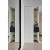
To remove the considerations of Eastern Feng Shui Chuan Tang Sha, the designer applied Changhong glasses, wooden cabinets that reveal light, non-transparent facades, and contrast combinations of blacks and whites. Appropriate space scenery arrangements and item placements are applied within the concaved area. Meanwhile, the designer set up a dressing mirror at the entryway entrance to extend visual experiences and hid the original electric box.
PROJECT DURATION AND LOCATION:
The project finished in Taiwan.
FITS BEST INTO CATEGORY:
Interior Space and Exhibition Design
|
PRODUCTION / REALIZATION TECHNOLOGY:
Mirrors, Changhong glass, wood paint, stone-grained piles, system cabinets, black-stained solid wood, clay plate, aluminum chandelier.
SPECIFICATIONS / TECHNICAL PROPERTIES:
The actual interior design range is 35-ping; the public area includes the entryway, the living room, and the dining room, while the private area includes the main bedroom and three children rooms.
TAGS:
modern style, brighter, spacious, soft and comfy
RESEARCH ABSTRACT:
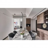
The designer used the modern style as the central concept. The space was packed with connections and echoes through neat linear designs and irregular rectangular geometries. Used the color black, grey, white, and other elements as the base for the public area while applying the stone adaption method on the edges and corners to make the overall material visually smoother. Presented neat lines on the wall using slots to make the whole wall layered. The dining room maintained the consistent style by placing the stone-grained table in the middle, echoing with the streamlined chandelier on the ceiling.
CHALLENGE:
The case is a new model house, which offered an outstanding condition and allowed the designer to exert freely; yet, the duration of time was a bit rushing because there were only three days to complete the design after signing the contract. To create the design within three days, the designer reduced the complicity for construction as much as possible. With simple yet different materials, color matching, and appropriate blanks, hoping to deliver a clean and straightforward space and imagination towards to future for the owner.
ADDED DATE:
2021-06-23 02:18:16
TEAM MEMBERS (1) :
Cheng-Hsien Wu
IMAGE CREDITS:
Home Chen Interior Design
|


