Erican Corporate Identity by Miko Lim |
Home > |
 |
|
||||
| DESIGN DETAILS | |||||
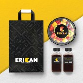
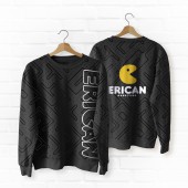
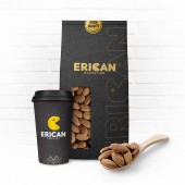
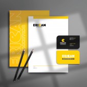
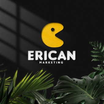
| DESIGN NAME: Erican PRIMARY FUNCTION: Corporate Identity INSPIRATION: Erican Marketing is a Food Wholesale Supplier in Malaysia. The given company name Erican Marketing does not really reflect the brand, as such there is a need to merge in external characteristics in terms of design to enhance brand recognition. When it comes to food, Pac man is nothing more than the most classic representative of eating. One of the biggest challenge for designers is to extend the design from the classic to what customers can associate with. Therefore the motive this time is to keep the classic and break through the tradition. UNIQUE PROPERTIES / PROJECT DESCRIPTION: This design is very simple but meaningful. The company name Erican is an abstract term. They worked on innovating the classic image of Pac-man while reserving its identifiable elements. This is the most special part of the project. The alphabet C in Erican is innovated and enhanced with Pac-man image that looks like a C, as Pac-man is closely related to most of our childhood, it hence works well in building a better connection with Erican Marketing and the market. This will help Erican to be more recognisable, associated, and memorable. OPERATION / FLOW / INTERACTION: Bringing out this design with Pac-man makes it easier to go through the heart of people. The logo is simple yet joyful. Besides, this logo can be cute and high-end at the same time, easy to change color but not degrading. Whether it is printed on food, cups, props, or even home appliances, it can be perfectly integrated. PROJECT DURATION AND LOCATION: The project started in February 2021 in Malaysia and finished in March 2021 in Malaysia. FITS BEST INTO CATEGORY: Graphics, Illustration and Visual Communication Design |
PRODUCTION / REALIZATION TECHNOLOGY: The original C letter is integrated into the start button to form a representative new era Pac-man. SPECIFICATIONS / TECHNICAL PROPERTIES: Letterhead 210mm x 297mm, business card 86mm x 50mm TAGS: Corporate Identity, Visual Identity, Branding, Logo, Food, Pac Man RESEARCH ABSTRACT: As the founder of Erican is a live broadcast master, Erican will be entering to the food live broadcast next, which means that it will soon become the leader of the catering industry. After research, Pac-Man, the classic representative of food eaters, is the irreplaceable leader and it has the meaning of eating up everything. CHALLENGE: The challenge of this project is that the name Erican, it is purely extended from the name of founder Eric, and it has no any special meaning. Therefore, the very first step is to integrate the cute Pac-man into the logo and at the same time, the logo shall look cute but not childish. After deciding to conceive using the famous Pac-man, the initial E was used to design at the beginning but it has been unable to get out from the original design. No matter how many emojis was added throughout the whole process, it is trapped in the traditional Pac-man, which can easily violate the originality. ADDED DATE: 2021-03-22 02:36:48 TEAM MEMBERS (3) : Creative Designer: Miko Lim, Brainstorming: Miko Lim and Hermes Yang and Copywriting: Miko Lim, Hermes Yang and Esther Sim IMAGE CREDITS: Miko Lim, 2021. PATENTS/COPYRIGHTS: Patented. TM2021007832. Erican Marketing (M) Sdn Bhd. 2021. Malaysia. Patented. TM2021007835. Erican Marketing (M) Sdn Bhd. 2021. Malaysia. |
||||
| Visit the following page to learn more: http://reurl.cc/AgXngp | |||||
| AWARD DETAILS | |
 |
Erican Corporate Identity by Miko Lim is Runner-up for A' Design Award in Graphics, Illustration and Visual Communication Design Category, 2021 - 2022.· Read the interview with designer Miko Lim for design Erican here.· Press Members: Login or Register to request an exclusive interview with Miko Lim. · Click here to register inorder to view the profile and other works by Miko Lim. |
| SOCIAL |
| + Add to Likes / Favorites | Send to My Email | Comment | Testimonials |


