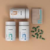
Novum.Lab Packaging Concept by Murilo Ferragut |
Home > |
 |
|
||||
| DESIGN DETAILS | |||||
| DESIGN NAME: Novum.Lab PRIMARY FUNCTION: Packaging Concept INSPIRATION: The visual identity should convey the message of "Specialists, technicians and innovators", emphasizing the sensation of innovation and science, with characteristics that refer to prevention and longevity. They did not want to seem like an inaccessible and elitist brand, nor did they want polluted marketing. As it is a new company in the market, the solution for the brand icon was to bring a simple and striking element, easily associated with such a vast market: we summarize the logo in an n + l UNIQUE PROPERTIES / PROJECT DESCRIPTION: Novum.Lab is the newest laboratory in the Health Tech segment. Specialists in human health, the company believes that health and well-being should not be limited to a portion of the population. Because of this, in order to reposition nutritional health, the focus is on research and innovation to create products with levels of quality previously considered impossible, developing innovative formulas with raw materials of the highest quality. OPERATION / FLOW / INTERACTION: The interaction with the end customer takes place at the pharmacy shelves and on the e-commerce website. The clean, minimalist and striking design positively helps the insertion of the new product on the market, generating brand value. PROJECT DURATION AND LOCATION: The project started in April 2020, in São Paulo, and ended in August 2020, and was shown on the curatorship of the World Brand Society. FITS BEST INTO CATEGORY: Packaging Design |
PRODUCTION / REALIZATION TECHNOLOGY: The bottle and cap are made of PET plastic (recyclable). The label is printed in offset, with a soft-touch finish giving a velvety touch, and localized varnish. SPECIFICATIONS / TECHNICAL PROPERTIES: Technical specifications: PET packaging - 42 mm mouth / White color / Height without cover 106 mm x Base diameter 58mm. Weight without cover 23g. Label dimensions 180 x 70mm. TAGS: Brand, Brand Development, Health Tech, Laboratory, Packaging, Pharmaceutical, Science, Visual Identity, Supplement RESEARCH ABSTRACT: For the construction of the logo, a handwritten font was chosen and designed among thousands of options, making it original and consistent. The white and light gray colors prevail in this neutral color palette, conferring sensations of purity, science, pharmaceutical, efficiency. The support colors, pastel blue, turquoise and peach, bring in their essence patience, calm, protection, comfort. The black used in the logo is powerful, empowering, imposing. CHALLENGE: The biggest challenge was to create a brand that would enter the market on an equal footing with competitors. An imposing, modern and serious brand was created, sending the message that the formulations are developed by great professionals in the sector, such as doctors, pharmacists and engineers. Novum.Lab produces formulas of the highest quality, and the visual identity should bring this idea. The color white gives the sence that the products are serious and from a pharmacist quality. ADDED DATE: 2021-02-26 18:54:54 TEAM MEMBERS (1) : IMAGE CREDITS: Murilo Ferragut, 2020. |
||||
| Visit the following page to learn more: https://www.ferragutdesign.com/novumlab | |||||
| AWARD DETAILS | |
 |
Novum.lab Packaging Concept by Murilo Ferragut is Runner-up for A' Design Award in Packaging Design Category, 2020 - 2021.· Read the interview with designer Murilo Ferragut for design Novum.Lab here.· Press Members: Login or Register to request an exclusive interview with Murilo Ferragut. · Click here to register inorder to view the profile and other works by Murilo Ferragut. |
| SOCIAL |
| + Add to Likes / Favorites | Send to My Email | Comment | Testimonials |


