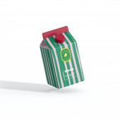
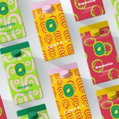
Liquid Lab Drinks Packaging by Eva Van der Borght |
Home > |
| CLIENT/STUDIO/BRAND DETAILS | |
 |
NAME: Eva B. Design PROFILE: Eva B. Design, is on a mission to bring more color and joy through design in a world otherwise filled with beige, white & grey. Eva B. Design believes that design should convey emotion and make you look twice, which can be seen throughout the client projects. |
| AWARD DETAILS | |
 |
Liquid Lab Drinks Packaging by Eva Van Der Borght is Runner-up for A' Design Award in Packaging Design Category, 2020 - 2021.· Press Members: Login or Register to request an exclusive interview with Eva Van der Borght. · Click here to register inorder to view the profile and other works by Eva Van der Borght. |
| SOCIAL |
| + Add to Likes / Favorites | Send to My Email | Comment | Testimonials |


