DESIGN NAME:
Bonjour
PRIMARY FUNCTION:
Residence
INSPIRATION:
The designer decided upon the core concept as to create a living space which keeps abreast of the times by utilizing flexible designs so that in this home could incorporate multiple dimensions: where one could hold meetings and work, where one could enjoy the solace of solitude, and where one could spend quality time with the children. With the horizontal spatial scale, the designer laid out a broad, continuous flow indoors and an exhaustive storage function.
UNIQUE PROPERTIES / PROJECT DESCRIPTION:
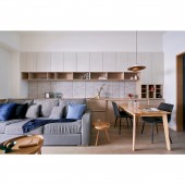
The designer employed soft, curved lines to outline the ceiling, main wall, and beams so that the communication between the arches symbolizes a rounded family, the placidity of the elaborately left blanks paired with the tightness of the curvatures form a static lyrical rhythm. As for the tone of the house, the designer adopted the nature-centric French Colonial style, using clean, elegant white as the base, while introducing rich, vibrant colors to bring forth harmonious visual aesthetics.
OPERATION / FLOW / INTERACTION:
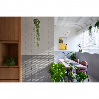
The designer preserved the layout and essence of the original architecture and decor on the terrace. The structure of the naked ceiling and the lampshades were furthered with elegant arched elements via the addition of diamond-patterned perforated hardboards, Venetian blinds, potted plants, distinctive lighting fixtures, and pastel-toned soft furniture items, setting a calm and relaxed mood when natural light falls onto the Chevron wood flooring. The original brick walls were able to traverse into modern-day with a dual design that balances the gray and the white.
PROJECT DURATION AND LOCATION:
2019 Neihu District, Taipei City, Taiwan.
FITS BEST INTO CATEGORY:
Interior Space and Exhibition Design
|
PRODUCTION / REALIZATION TECHNOLOGY:
Lotos plaster, Marble, Melamine boards, Laminate flooring, Imported tiles, Environmentally friendly coatings, Hardware, Glass, Colored glass.
SPECIFICATIONS / TECHNICAL PROPERTIES:
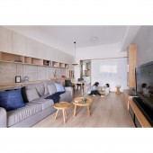
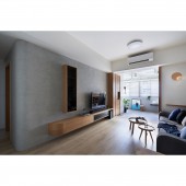
The designer utilized a two-centimeter decoupled design to make the beams on the ceiling and the TV wall seem detached yet in sync. By studying how traffic could flow smoothly in the space, the designer was able to clearly differentiate public and private functions for each area, and with the effect of twisting and curving lines, sharp angles were softened, lifting the oppression that the beams and columns give off. As for the sofa wall, upper and lower cabinets with plenty of storage space were installed while the mid-section was left blank moderately to couple with clear-cut, irregular linear designs, bringing joyfulness to the room.
TAGS:
French Colonial, Nature, Flexible design, advancing with the times, Curvatures.
RESEARCH ABSTRACT:
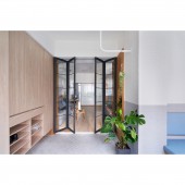
The designer installed folding glass doors between public and private areas. Hooks made out of galvanized iron right by the entrance to the living room could be used for either working out or hanging potted plants. The elegant curved designs create smooth flows and harmonious visuals within the space, and the geometric upper and lower cabinets on the sofa wall, with the splashes of brilliant colors, shapes the area into a living space full of comfort, aesthetics, and texture. The master bedroom was designed into an elevated Japanese-style room.
CHALLENGE:
The designer utilized sensible arched designs as the chief motif, organizing a fluid traffic flow, and subsequently resolving spatial and mental pressure. The biggest challenge of this project was carefully and precisely measuring the radian and size of the curvatures. After several patternings, a proper and fitting arch was finally achieved. Moreover, the proportions and angles of the TV wall were also calculated meticulously, and with the installment of vertical shelves and horizontal cabinets, a simple yet pleasing vista was thus framed.
ADDED DATE:
2020-06-11 08:32:33
TEAM MEMBERS (1) :
Wide Design
IMAGE CREDITS:
Wide Design
|


