Branding Hugging Flavor Hugging Flavor by Hwajin Jo |
Home > |
 |
|
||||
| DESIGN DETAILS | |||||
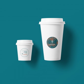
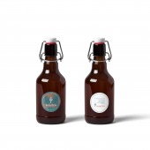
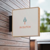
| DESIGN NAME: Branding Hugging Flavor PRIMARY FUNCTION: Hugging Flavor INSPIRATION: Design is to love others because design gives visual solution to clients. The motivation to help my client's pressing circumstance and the flavor of the client's Dutch coffee were the inspiration. As for the logo, "coffee" from the cafe and "a new life" from the church name, a core keyword to my client are melted into the symbol because the client is the owner of the cafe and the pastor of the church on the cafe. The drops of Dutch coffee are gathered into a big drop as a tree silhouette. Reddish brown color due to existed an interior color, and bluish green color as a point color have been selected. UNIQUE PROPERTIES / PROJECT DESCRIPTION: This project contains art as well as design. Art is to bring up the artist's inner voice to outside. The design is to give the solution of outer requirements. "Art" means the combination of the client's flavored Dutch coffee and a painting of the project director and "Design" means branding design including logo, sign, business card, x-banners, stickers, online/offline ads, and menu in this project. OPERATION / FLOW / INTERACTION: The project has done by communicating with the director, the client and the makers until realizing the design. When selecting the final logo design, there was a communication iteration between the director and the client. When issues occurred to realize the graphic design, the iteration between the director and makers to solve the issues had done. PROJECT DURATION AND LOCATION: The project had been in progress in August 2019 in Cheongju, South Korea. FITS BEST INTO CATEGORY: Graphics, Illustration and Visual Communication Design |
PRODUCTION / REALIZATION TECHNOLOGY: The consideration for my client is a priority in a way that won't hurt the main stream. The existed interior design was wood concept and that was an advantage consistent with the color of Dutch coffee and emotion to keep. The point color of the logo has been in harmony with the wood space. The brand's sign has been changed to wood style while processing based on the existed inner space in the sense of unity between inside and outside. SPECIFICATIONS / TECHNICAL PROPERTIES: The outdoor sign: 40 x 40 x 14cm, The X banners: 600 x 1800 mm, The stickers: dia. 5cm, The offline ads: 80 x 120 mm, The menu board: 225 x 330 mm (The inner menu: A4size), The painting: 16 x 16 cm, Mixed media on canvas TAGS: branding, logo, design RESEARCH ABSTRACT: Googling was a method to find out general idea regarding key words for logo design such as life, Dutch coffee, and trees. And almost ideas were from my daily scenery while walking afternoon. CHALLENGE: Field consideration was needed while the project. For example, real options for electronic lines for the outdoor sign, the light bulbs' type inside the sign for the night should be considered contrary to the only graphic design. And printing options was also challenging because the logo color is special and rare, so that cannot be found in an existing palette to make up. The challenges has been solved by communication with the makers. ADDED DATE: 2020-03-19 13:43:49 TEAM MEMBERS (1) : IMAGE CREDITS: Hwajin Jo, 2019. |
||||
| Visit the following page to learn more: https://c11.kr/e6b0 | |||||
| AWARD DETAILS | |
 |
Branding Hugging Flavor Hugging Flavor by Hwajin Jo is Runner-up for A' Design Award in Graphics, Illustration and Visual Communication Design Category, 2019 - 2020.· Press Members: Login or Register to request an exclusive interview with Hwajin Jo. · Click here to register inorder to view the profile and other works by Hwajin Jo. |
| SOCIAL |
| + Add to Likes / Favorites | Send to My Email | Comment | Testimonials |


